Strategy & Brand
Web design Hampshire
WordPress websites for Hampshire consultancies, charities, clubs and growing businesses
Hampshire runs from city-centre Southampton and Portsmouth through Winchester, Basingstoke and the market towns, and the business mix is just as wide: professional services, charities, sports clubs, heritage organisations, manufacturers and owner-led firms. What they share is competition. A website has to earn attention quickly and look like the calibre of the business behind it.
We build bespoke WordPress sites for businesses across the county. Fast, properly built, and made to make it easy for the right people to take the next step.
Websites from £4,000
Most projects 8 to 16 weeks
Bespoke, never templated
Why Rubber Duckers is your go-to Hampshire web design agency
People buy from people. Our job is to make the bond between a business and its people visible.
The pattern we see most often is the same one across the county: the business has grown through reputation and referral, and the website is the one piece that hasn't kept up. People arrive via search, the site doesn't communicate clearly or load quickly, and the enquiry never happens.
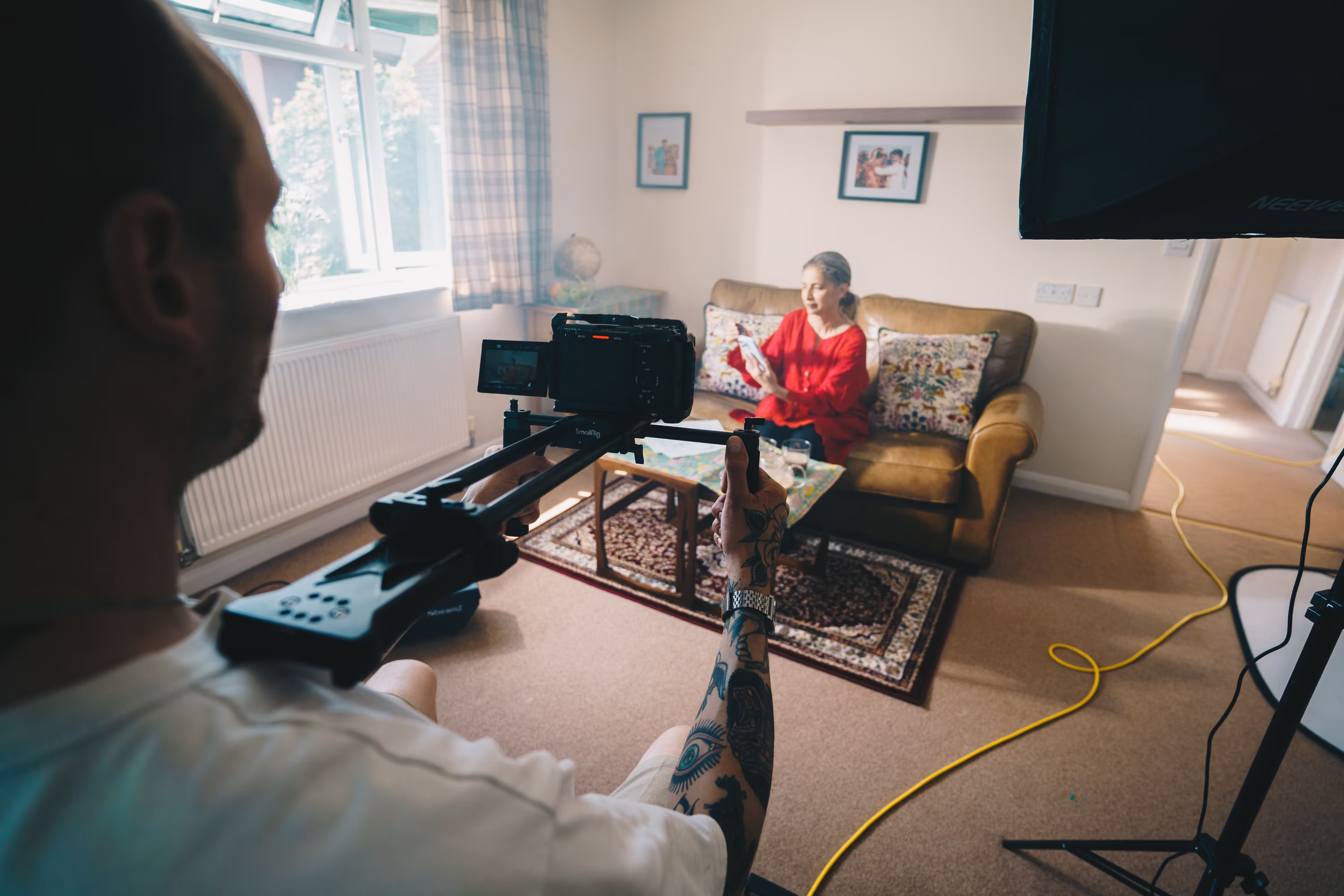
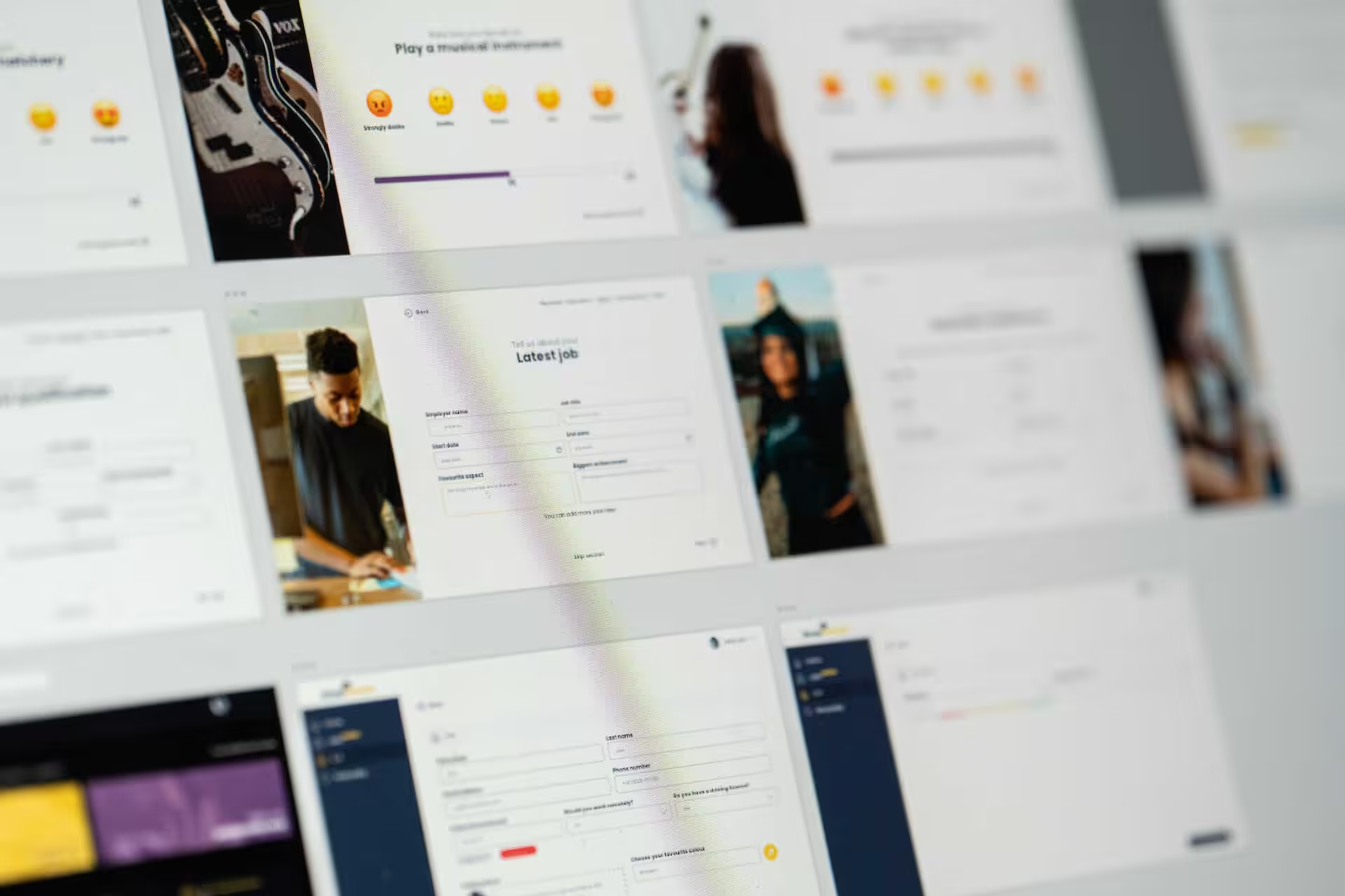
We plan the website, photography and video together from the first conversation, not as separate jobs added later. Before we design anything, we run a deep dive with your key people and short questionnaires with a few of your staff and best customers, so the site is built on how your culture actually shows up rather than a list of values nobody recognises.
Bespoke web design Hampshire
Built properly, with care
A website carries the first impression, and the details decide it. Structure, speed and design all have to pull in the same direction.
We build bespoke sites that reflect your brand and make it easy for visitors to enquire, book or buy. No off-the-shelf themes that look sharp on launch day and start to sag six months later; here's why we build bespoke rather than from a template.

WordPress web design Hampshire
WordPress, done cleanly. Flexible, easy to edit.
Every build is flexible, quick to update, and set up with solid SEO foundations from day one. We use reusable content blocks, so a marketing team, a charity's volunteers, or a founder fitting it in between meetings can change text, swap imagery and add sections without touching code or breaking the layout.
The site grows with you instead of becoming a job for the developer every time.
User-friendly CMS
Making website management easy for everyone
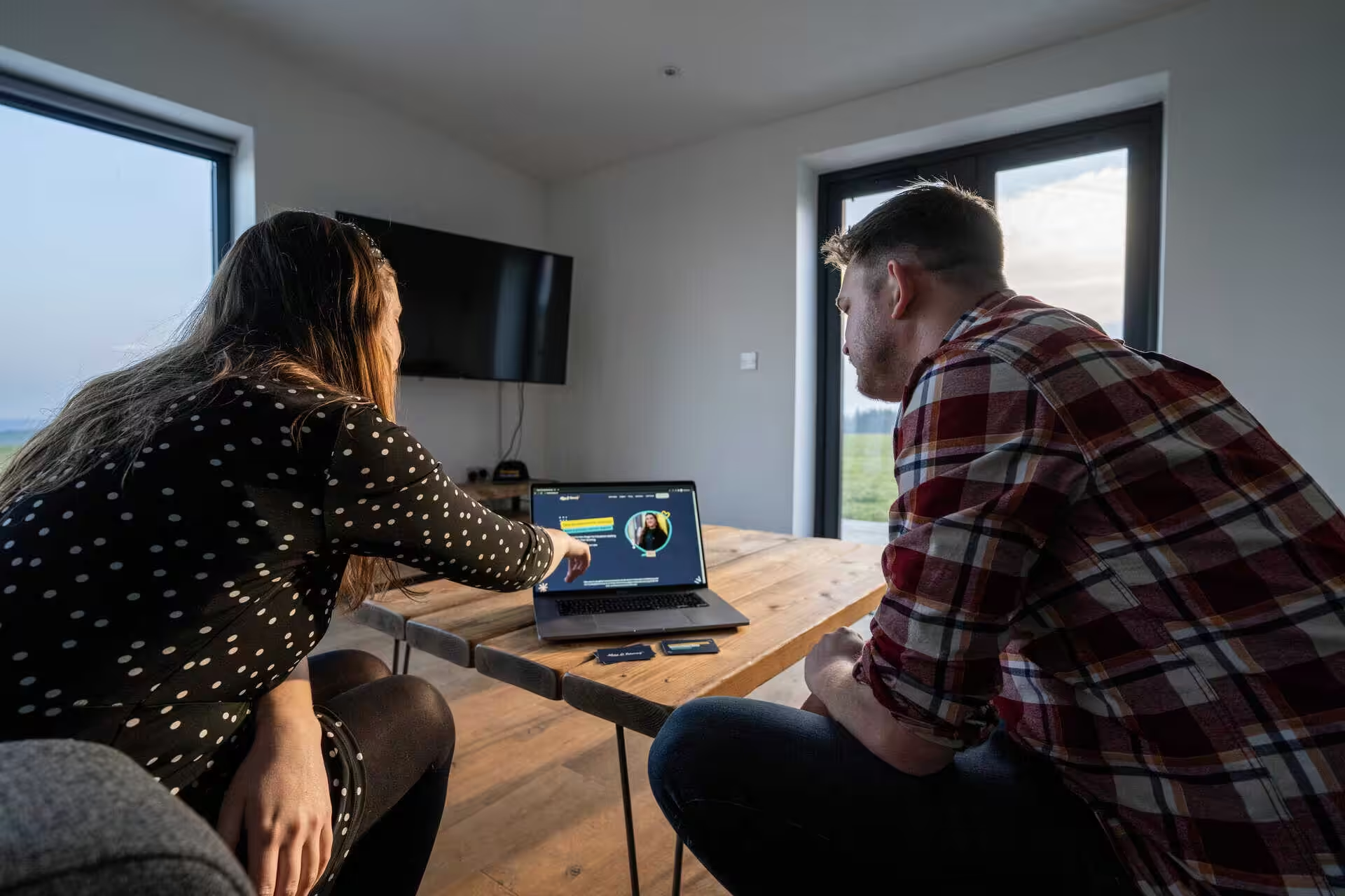
We set every site up so you can edit text, swap images and add pages without messaging a developer. Then we train you properly, with screen recordings and simple guides your team can come back to, so everyday changes feel easy whoever ends up making them.

Ongoing support and maintenance
Done for you website maintenance
Going live is the beginning of the relationship. We handle updates, backups, security monitoring and ongoing care plans, and we are there quickly when something breaks at the worst possible moment.
We look after more than 40 client sites this way. For teams without an in-house developer, that backup keeps things reliable while you get on with the work.
Responsive and mobile website design Hampshire
A responsive website is ready for every screen
Most people will look you up on a phone before anything else, so responsive design is non-negotiable. We build for every screen with Core Web Vitals in mind, so pages stay quick and stable, and to WCAG 2.2 AA accessibility as standard, which helps real users, screen readers and the AI agents now reading sites on people's behalf.
For the detail on layouts, breakpoints and what mobile-friendly actually means, read our guide to responsive web design.
Why Hampshire businesses trust Rubber Duckers
ur clients tend to care about getting the substance right, not just the surface. We work the same way: clean builds, clear communication, and sites that still perform two or three years after launch.
📍
Local knowledge
We know Hampshire and its audiences, and what local customers need to see before they feel confident clicking contact.
🧩
Custom solutions
Design and development shaped around your goals, your content, and how you actually sell.
🛠️
Ongoing support
Reliable maintenance and quick help to keep your site secure, updated and running well.
💑
People-first design
Clear navigation, readable layouts and conversion-led pages that make the next step feel easy.
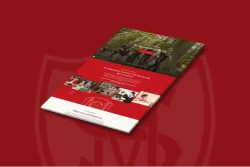
The PHA Homes story
PHA Homes provides homes in Petersfield, and wanted a website that did justice to the service behind it. The old site was dated and hard to manage, and it didn't show the people or the care that set them apart.
We rebuilt it as a bespoke WordPress hub, with video and photography of the real team and residents, so the site feels like the organisation rather than a stock-image stand-in. It is now modern, easy to run, and a true reflection of how they work.

Linda Wallace
Chief Exec, PHA Homes
"We now have a website that really speaks to our mission."
I can’t really tell you how pleased I am with the website. I think you have done an incredible job for us – whilst being absolutely lovely to work with. It means so much to us to have a website that really speaks to our mission and allows us to start to use it as a tool to serve our residents and the community more widely. Thank you!
Read the full case study
Some of the organisations we work with


Rae Walters
CEO, RWAF
The improvements in functionality and navigation are immediately noticeable, and the overall design feels much more modern with a significantly better user experience.
It's been great to incorporate new technology that makes the back-end processes much more streamlined and efficient.

Cristina Gueco
Senior Engagement & Outreach Manager, GAN Global
Our old site was outdated and a struggle to manage without a dedicated webmaster, and the new one is the opposite: modern, intuitive, and genuinely enjoyable to use. They cared as much about the back-end experience as the front, and the result is a site that looks brilliant, reflects who we are, and has already impressed our stakeholders.

Nicola Ayrton-Guest
Museum Director, Household Cavalry Museum
We had a fantastic experience working with Rubber Duckers on the redevelopment of the Household Cavalry Museum website. From the outset, they took the time to really listen to us. They wanted to understand our weak points and appreciate our key goals, particularly around driving income through the website and ensuring a mobile-first experience.
Linda Wallace
Chief Exec, PHA Homes
I’m so pleased with the website. You’ve done an incredible job and been genuinely lovely to work with. Thank you.

Philip Warr DL
Chief Executive, Purpose Homes
Ever reliable and responsive, Rubber Duckers have supported us to achieve triple digit growth by articulating both what we do and what we offer as a business.

David Vosser
Treasurer, Hampshire Athletics
Excellent team to work with, who helped us Design, Develop and Launch a new web site. Helpful and open guidance was vey much appreciated through what could have been a tricky journey. The outcome is a new web site fully supported which is just what we wanted. Thank you.
Nicola Reid
Director, Avonclyde Bespoke Labels
We got the Rubber Duckers in to fully revamp our website as well as carry out a photo and video shoot on site. They took the time to understand our business and what we were trying to achieve.

Jonathan Pierre
Founder, The Something More Club
Ross came to take photographs for our first-ever live experience, The Something More Club™.
Not only was he super easy to work with, but we also had the fully edited photos back the next morning, ready for publishing on our socials: top man and top-quality work.
I'd recommend Ross to all of my business contacts without hesitation.

Donald Young
Director, Coconut Lime
Recently helped me to migrate our company website and we've set up a yearly care plan so I don't need to worry about updates/backups anymore 🥳

Ben Vallance
Founder & CEO, AmzIncubator
Ross and Chris made everything easy to follow and nailed the project scope, delivering quickly and beyond expectations. They’ve been great to work with, and I’d happily work with them again or recommend them for any website project.
Hannah Lewis
Owner, Bridge Beauty
The photography & videos all brought the site to life. I wouldn’t hesitate to recommend this professional, friendly, fun & happy company to anyone! Thanks guys you’re ducking awesome 🐥
Jon Tilt
Coach, Southampton Athletic Club
We worked with Rubber Duckers to make our athletics club website the best of the best and they did a superb job. I can highly recommend this team.

Aline Boblin
Founder and CEO, Menopause Knowledge CIC
As a small organisation, we really appreciated the ease of communication and how the project was completed in a straightforward manner.

Leon Yemoh
Programme Director, Street 2 School
The energy and enthusiasm the guys at Rubber Duckers brought to the project was amazing. They've given us the best chance to stand out with a slick website and engaging content.

Tomasz Dyl
Managing Director, GottaBe! Marketing
We have worked with the Rubber Duckers for over 8 years now. They've been brilliant - very supportive, always hands-on and dedicated.

Natalie Meagher
Head of Housing, PHA Homes
It’s been a really positive experience, and I’ve genuinely enjoyed working with you. I’d never been involved in developing a new website before, but you made the process smooth and surprisingly interesting. Thank you for your amazing support in bringing our new website to life.

Desmond Moreira
Founder & CEO, Be Original
These guys are fab, amazing to deal with and produce some really good work!

Liam Charmer
Founder & CEO, Remiam
Great people worked with for many years.

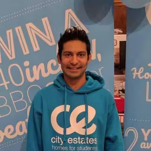
Mikey Basra
CEO, City Estates
I have used Rubber Duckers for many years now and will continue to do so, as the quality of their work, from designing websites, to videography and photography, is simply fantastic.

Geoff Sim
Coach & Mentor, Coach & Mentor
Their ongoing support and personable nature made it easy for me to ask those ‘silly questions’, I cannot recommend them highly enough and look forwards to continuing working with them. You are my absolute go-to in the digital space!

Matt Ray
Entrepreneur,
The team are highly professional, skilled and dynamic. I have always appreciated the attention to detail and the ability of the team to bring a vision to life.

Chris Mills
Director, Voyage Financial Planning
The whole process from start to finish was so easy and professional. They made the whole experience calm and light hearted.
Charlotte Butler
Founder, Alfie's Wish
You really understood the brief to create a beautiful but professional charity film for us. We look forward to working with you again in the future.

Tracey Jones
Chair, Southampton Athletic Club
Rubber Duckers didn't just build us a website; they created a digital hub that truly reflects our club's spirit. The integrated functionality has transformed how we manage volunteers, records, and fixtures, making everything seamless.
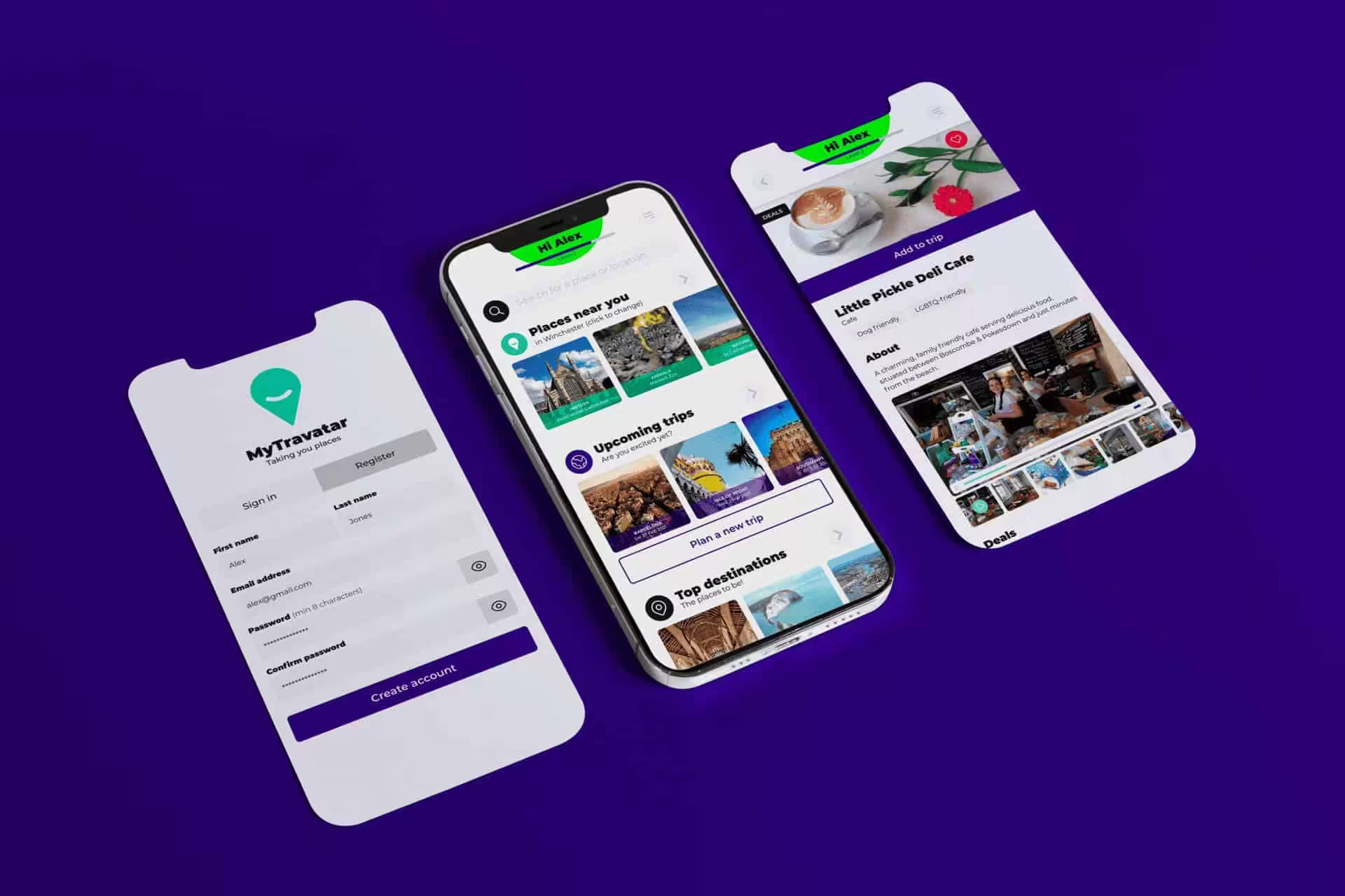
Paul Sherry
Founder & CEO, MyTravatar
I found the approach very effective and efficient whilst having a solid input into the marcomms strategy that we will utilise. I would recommend Rubber Duckers to any business, and I look forward to utilising their knowledge again.
Nick Basra
Landlord, City Estates
We have worked with Rubber Duckers for the best part of 10 years now and the whole team stand out for their work and efforts to keep us happy as customers.

Kevin Stansfield
Sales Director & Head of Coaching, ActionCoach
Great company of passionate guys.
Our Hampshire web design process
You always know what is happening next. Most full builds take around 8 to 16 weeks, depending on feedback pace and how ready your content is.
Clarity
We start by getting to know you first.
Your audience, message and goals become a page plan and site structure that supports real journeys and makes it easy for Google to understand what you do.
💬
Craft
Built from scratch, because it matters.
We design and build from scratch, with intent: fast-loading pages, flexible sections, clean code, and layouts that guide people towards enquiring, booking or buying, with on-page SEO foundations built in. No template bloat.
✏️
Care
The relationship carries on past launch.
You get proper training, tidy documentation, and the option of ongoing support to keep the site secure, updated and performing.
💛
What it looks like in practice
✅
Discovery and planning: sitemap, page plan and priorities.
✅
Deep dive: stakeholder interview plus staff and customer questionnaires.
✅
Design: look, feel and key page layouts.
✅
Build and content integration: WordPress development with on-page SEO foundations.
✅
Feedback and refinement: structured rounds that keep momentum.
✅
Go live and aftercare: a careful launch, checks, then support options.
Prefer the full, step-by-step version? Browse our Working with us guide and process docs.
The right type of website for what you do
Most projects start the same way: the business has grown and the site hasn't. The fix starts with what the site needs to do for your specific audience.
Bespoke website
Custom-built around your goals and content, designed to convert the right kind of visitor.
Service-based website
For consultants, agencies and professional services that need to build credibility fast and turn it into enquiries.
WordPress website
A flexible, easy-to-update build that stays fast and tidy as you grow.
eCommerce website
Product discovery, trust signals and a smooth checkout, so customers can buy without hesitation.
Charity or non-profit website
Clear and warm, built for low-friction actions: donate, sign up, volunteer, attend.
Sector specific website
Listings, memberships, ticketing, capability pages. Some industries come with extra moving parts, and we build for them.
FAQs about web design in Hampshire
Areas we cover
Web design across Hampshire and the south coast, delivered remotely across the UK and internationally.
Sector-specific web design
Some industries come with extra moving parts: memberships, donations, listings, compliance.
Let's work together
"(Required)" indicates required fields