Mastering the Art of Colour Grading: A Step-by-Step Guide
Colour grading is the process of enhancing the visual appearance of images or videos by adjusting various attributes such as contrast, colour balance, saturation, and brightness. This intricate art plays a pivotal role in content creation across a multitude of media forms, including cinema, photography, and digital design. By manipulating colours to evoke specific emotions and set the tone, colour grading significantly enhances the storytelling aspect and overall aesthetic appeal of any project.
Mastering the art of colour grading can elevate your projects to new heights. It allows you to:
- Create a consistent visual language throughout your work.
- Highlight important elements and guide viewers' attention.
- Enhance mood and atmosphere to support narrative themes.
At Rubber Duckers, we have consistently demonstrated the power of effective colour grading in transforming visuals. By embracing this skill, you can boost engagement and convey complex messages more effectively. For insights on leveraging visual content to enhance user experience, explore our guide on harnessing the power of video.
The journey towards mastering colour grading begins with understanding its fundamental principles. However, it's also crucial to grasp the broader context within which these visuals are presented. This includes having a solid understanding of UX design, which plays a vital role in creating meaningful experiences for users across various platforms. Ready to dive deeper? Let’s get started!
Understanding the Basics of Colour Grading
Key Elements: Luma, Hue, and Saturation
Colour grading relies on three essential elements:
- Luma: Refers to the brightness or luminance of an image. Adjusting luma can make a scene appear brighter or darker, impacting the overall mood.
- Hue: Represents the actual colour within the image. Shifting hues can transform an image's colour palette, from warm tones to cool ones.
- Saturation: Indicates the intensity or purity of the colours. Increasing saturation makes colours more vivid, while decreasing it results in a more muted appearance.
Each element plays a crucial role in defining the visual aesthetics of an image or video. By manipulating these factors, you can create a specific atmosphere that aligns with your creative vision.
Lumetri Scopes for Colour Analysis
In professional colour grading, Lumetri Scopes are invaluable tools. These scopes provide real-time visual feedback on your adjustments, helping ensure accurate and balanced colours. Key types include:
- Waveform Scope: Displays luma information across the image.
- Vectorscope: Highlights hue and saturation levels.
- RGB Parade: Shows individual Red, Green, and Blue levels.
Using these scopes allows for precise control over your colour grading process.
Colour Correction vs Colour Grading
It’s essential to distinguish between colour correction and colour grading:
- Colour Correction: Focuses on fixing technical issues such as exposure problems, white balance errors, and inconsistent lighting. It's about making footage look natural and consistent.
- Colour Grading: Involves applying stylistic adjustments to convey a particular mood or aesthetic. This might include enhancing certain colours or shadows to evoke emotions and support storytelling.
Understanding these concepts ensures that your visuals not only look technically sound but also artistically compelling.
Exploring Essential Tools for Colour Grading
When it comes to colour grading, the choice of software can significantly impact your workflow and the quality of your final output. Among the most popular tools are Photoshop, After Effects, and Davinci Resolve by Blackmagic Design.
Photoshop
Ideal for photographers and graphic designers, Photoshop offers robust features for image manipulation. With its extensive toolset:
- Adjustment Layers: Non-destructive edits that allow you to tweak colours, contrast, and brightness.
- Colour Balance: Fine-tunes the colour tones in an image for achieving the perfect look.
- Curves and Levels: Provides precise control over luminance and colour channels.
After Effects
For motion graphics and video editors, After Effects is a powerful tool that integrates seamlessly with other Adobe products:
- Lumetri Colour Panel: Advanced colour correction and grading capabilities right within the software.
- Keyframing: Enables dynamic adjustments over time, making it perfect for animations and motion graphics.
- Integration: Works well with Premiere Pro for a streamlined video editing process.
Davinci Resolve by Blackmagic Design
Renowned in the film industry, Davinci Resolve offers an unparalleled suite of features tailored for professional colourists:
- Node-Based Workflow: Allows complex adjustments through nodes, each representing a specific change or effect.
- Colour Wheels: Offers detailed control over primary and secondary colours.
- Scopes: Includes waveform monitors, vectorscopes, and histograms to ensure accurate colour representation.
These tools cater to different needs but share a common goal: elevating your visual projects through meticulous colour grading.
The Role of Colour in Visual Storytelling
Colour has an unparalleled ability to convey emotions, set the tone, and guide the viewer's attention within a narrative. Understanding the importance of cinematic colour grading can transform your projects into powerful visual experiences.
Emotional Impact:
- Warm colours like red and orange often evoke feelings of passion, warmth, or danger.
- Cool colours such as blue and green can create a sense of calm, sadness, or detachment.
Tone Setting:
- Bright and saturated palettes can make scenes feel light-hearted and whimsical.
- Muted and desaturated colours often lend a more serious or somber tone.
Guiding Attention:
- High contrast can draw attention to specific elements within a frame.
- Subtle shifts in hue can direct viewers' focus without them even realising it.
Iconic Filmmakers and Their Distinct Colour Palettes
Several filmmakers have mastered the art of cinematic colour grading, each with their unique approach:
Wes Anderson: Known for his symmetrical compositions and pastel colour palettes, Anderson creates whimsical worlds that are instantly recognisable.
"The Grand Budapest Hotel" showcases his use of pinks and purples to set a nostalgic yet vibrant tone.

Tim Burton: Utilises dark, gothic hues to bring his fantastical and often eerie stories to life.
In "Edward Scissorhands", the contrast between the dark castle and brightly coloured suburban homes accentuates the film's themes.

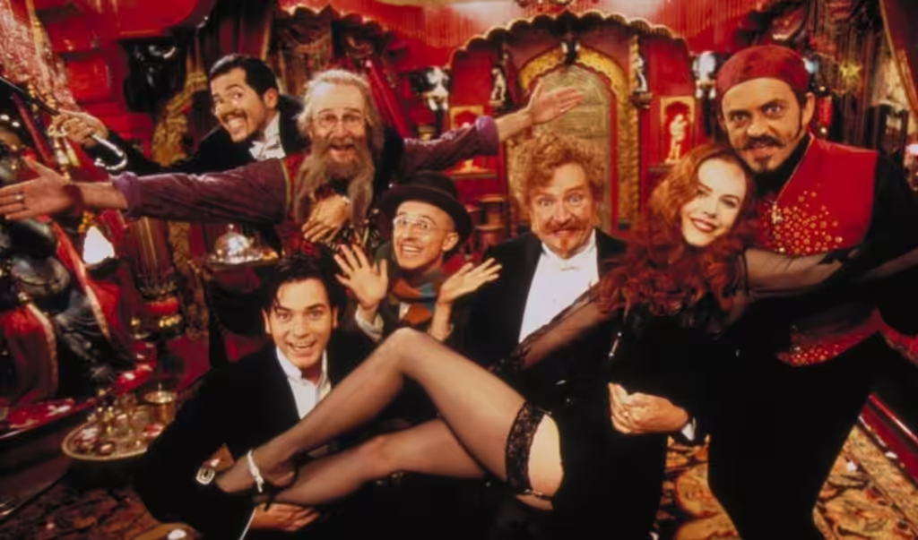
Baz Luhrmann: Employs bold, saturated colours to create visually stunning cinematic experiences.
"Moulin Rouge!" uses vivid reds and golds to enhance its opulent, theatrical atmosphere.

Historical Influence
In traditional film labs, colour timing was crucial in creating desired looks. This practice has heavily influenced contemporary digital workflows, allowing modern creators to achieve precise colour grades that align with their artistic vision.
Mastering the Technical Aspects
Delving into the technical side of colour grading unveils a world of precision and innovation. High Dynamic Range (HDR), for example, allows for a wider range of colours and contrasts, making visuals more lifelike. When working with footage recorded in RAW or LOG formats, you have unmatched flexibility. These formats keep more image data, so you can make extensive adjustments during post-production without losing quality.
Understanding RGB colours and different colour spaces is crucial for keeping visual consistency across various devices and platforms. The RGB colour model is the basis of digital imaging, using combinations of red, green, and blue light to represent colours. Different colour spaces like sRGB, Adobe RGB, and DCI-P3 have their own characteristics that affect how colours look on different screens.
- HDR: Enhances contrast and colour range.
- RAW/LOG formats: Preserve more image data for detailed post-production work.
- RGB colours: Fundamental model for digital imaging.
- Colour spaces (sRGB, Adobe RGB, DCI-P3): Ensure consistent visuals across devices.
Mastering these technical aspects ensures that your colour grading efforts translate effectively from your editing suite to the viewer’s screen, delivering a consistent and impactful visual experience.
Colour Grading Across Different Industries
Colour grading is a versatile tool that adapts to the unique needs of various industries, each with its own set of challenges and opportunities.
Cinema
In cinema, colour grading is crucial for storytelling. Directors like Wes Anderson and Tim Burton use distinct colour palettes to evoke specific emotions and enhance their narrative styles. For example, Wes Anderson's use of pastel hues creates a whimsical atmosphere, while Tim Burton's darker tones add to his films' gothic feel. The precision required in cinema demands a deep understanding of colour theory and the ability to maintain consistency across numerous scenes.
Photography
For photographers, colour grading can transform an image by highlighting certain aspects and evoking a desired mood. Fuji cameras are renowned for their rich colour profiles, which allow photographers to achieve stunning results straight out of the camera. However, post-processing can further refine these images. Photographers often face the challenge of balancing natural skin tones with vibrant backgrounds, especially in portraits or nature shots.
Social Media
Social media platforms like Instagram have popularised unique colour grading styles. Influencers often use presets or filters to create cohesive feeds that resonate with their audience. Here, the challenge lies in standing out while maintaining a visually appealing and consistent look. Colour grading on social media must be quick yet impactful, catering to the fast-paced nature of content consumption.
Nature Documentaries
Nature documentaries benefit significantly from sophisticated colour grading techniques. The goal is to enhance the natural beauty of wildlife and landscapes without compromising authenticity. Colourists working on nature documentaries often deal with footage from diverse environments and lighting conditions, requiring meticulous adjustments to ensure that every scene looks breathtakingly real yet vibrant.
Each industry utilises colour grading differently but shares the common goal of enhancing visual storytelling through careful manipulation of colour and tone.
Effective Techniques and Inspirations
Achieving the perfect colour grade often requires a combination of technical skill and creative vision. Here are some essential techniques:
- Careful Adjustments: Fine-tuning aspects such as contrast, brightness, and colour balance can dramatically alter the mood of a scene. Utilising tools like curves and colour wheels allows for precision in these adjustments.
- On-Set Gels/Filters: Creative use of on-set gels and filters can pre-emptively shape the colour palette, saving time in post-production. For example, using a blue gel can create a cooler atmosphere right from the shoot.
Historically, colour timing in film labs played a significant role in shaping the final look of movies. This process involved adjusting the exposure of the film stock to correct or enhance colours, setting the foundation for modern digital workflows.
Drawing inspiration from renowned cinematographers and filmmakers enriches any colour grading practice.
- Martin Scorcese: Known for his dynamic use of colour to signify different eras and emotional states, his work in films like Goodfellas showcases how strategic colour grading can enhance narrative depth.
- Alfred Hitchcock: His meticulous approach to colour in films like Vertigo demonstrates how specific hues can evoke psychological tension and suspense.
These examples highlight the impact of thoughtful colour adjustments and historical practices on contemporary workflows, offering invaluable lessons to both novice and experienced colourists.
Conclusion
Achieving mastery in colour grading is a journey that requires dedication, creativity, and a willingness to experiment. By continually honing your skills, you can transform ordinary visuals into compelling stories that captivate and engage audiences.
Practice and Experimentation:
- Regularly work on diverse projects to expose yourself to different styles and techniques.
- Experiment with various software tools and settings to discover what works best for your unique vision.
- Study the works of renowned filmmakers and photographers to understand their use of colour.
By embracing continuous learning and creative exploration, you'll find that mastering colour grading is not just a skill, but an art form that can elevate your projects to new heights.
If this article has been useful, let us know!
Want visuals that pop? Our video production services include expert grading to match your brand.


