Strategy & Brand
Not just a pretty face: web design strategies that actually drive leads
If your website looks the part but doesn’t pull its weight, it’s time for a rethink. This guide walks through smart, lead-focused strategies for growing brands, from better structure and landing pages to visuals and CTAs that actually move the needle.
A lot of growing companies have the same website story.
You built something when the business was smaller, it did the job, nobody died. Then the company grew, your offer got sharper, your sales process matured, and the website stayed exactly where you left it, wearing skinny jeans from 2012.
If you’re a marketing manager or director, you feel it first. Campaigns get better, brand gets stronger, the site keeps politely underperforming.
This one’s about fixing that, properly.
The real job of your website
Your site needs to do three things, in this order:
- Help people understand you quickly
- Build trust fast
- Make the next step obvious
Everything else is decoration. Sometimes lovely decoration, but still.
Strategy 1. Build the site around outcomes, not pages
Most sites are organised like an internal org chart. The visitor does not care. 😅
Start with outcomes:
- I need a quote
- I need to understand your process
- I need to prove you’re legit
- I need to share this with my boss
Then design the journey around those moments. Your sitemap becomes a sales tool, not a folder structure.
If you want to see how we map things, our process page lays it out clearly:
https://rubberduckers.co.uk/about/process/
Strategy 2. Elevate the brand feel so it matches the business today
This is the big one for companies that have outgrown “basic website”.
If the site looks cheaper than the real experience, you attract the wrong enquiries. You also make good prospects nervous, because the first impression feels off.
The fix is rarely “make it fancy”. It’s:
- Clear messaging and confident design
- Real visuals that feel like your brand
- A level of polish that says, “yes, we know what we’re doing”
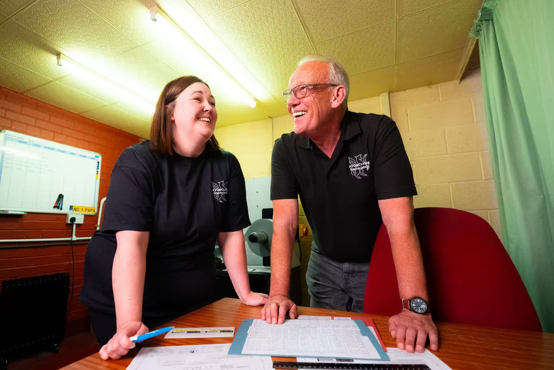
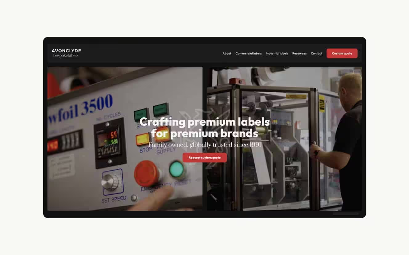
A good example is Avonclyde Bespoke Labels. They’d grown, their old homemade Wix site hadn’t. We rebuilt it as a bespoke WordPress site with proper storytelling and visuals, planned alongside the build so everything actually fits.
Case study here:
https://rubberduckers.co.uk/work/bespoke-labels/
Strategy 3. Add landing pages that match real intent
One homepage can’t carry all your marketing.
If you’re running paid ads, LinkedIn campaigns, email pushes, or targeting specific sectors, you need landing pages that speak to each audience with the right angle, proof, and CTA.
This is where leads get better, and sales teams stop moaning.
Back to Bespoke Labels for a concrete example. Once the new site and landing pages were live, they ran Google Ads and tweaked over time, tightening targeting with negative keywords. The result was fewer random enquiries and more from the industries they actually want.
They tracked it too: 24 brochure downloads, 15 quote forms, and two new customers. Their old benchmark was sending out 500 sample packs and being happy with two customers. Same outcome, way less chaos, and the site became part of the engine.
That’s what “website as a tool” looks like.
Strategy 4. Give people two conversion paths, fast and slower
Service sites usually have two types of visitor:
- Ready now, wants a quote or a call
- Curious, needs reassurance and info first
Your site should cater to both without turning into a maze.
A simple setup that works well:
- Primary CTA: book a call or request a quote
- Secondary CTA: download something useful, brochure, pricing guide, checklist, case study pack
The secondary CTA catches good prospects who are not ready to raise their hand yet, then gives you a way to follow up.
If you want a clean, low-pressure next step for people, we push our intro call for exactly this reason:
https://rubberduckers.co.uk/contact/intro-call/
Strategy 5. Use proof like a grown-up
Testimonials, case studies, logos, numbers, outcomes. Sprinkle them where decisions get made, not shoved on one page nobody reads.
A few high-impact places:
- Near your primary CTA
- On service pages, especially the tricky ones
- In the “why us” section, because everyone has one
- On landing pages tied to paid traffic
If you’ve got proper client feedback, show it. Here’s ours if you want the vibe:
https://rubberduckers.co.uk/wall-of-love/
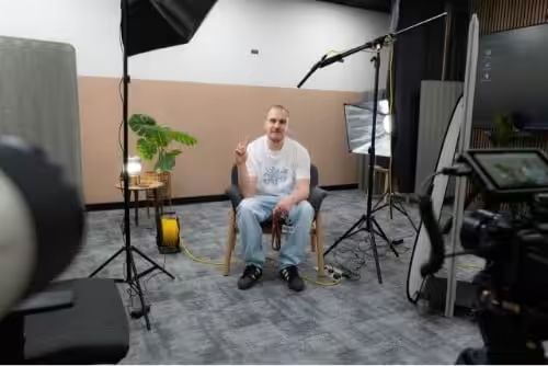
Strategy 6. Build the visuals into the plan, not as an afterthought
Visual websites win because they feel real.
Stock photos make even brilliant companies feel generic. Real photo and video makes people trust you faster, understand you quicker, and stick around longer.
When we plan visuals alongside structure, they stop being decoration and start doing a job:
- Homepage video that sets the tone
- Team and behind-the-scenes shots that humanise the brand
- Location, product, process, whatever builds credibility
If that’s part of your next build, these are useful starting points:
- Web design: https://rubberduckers.co.uk/web-design/
- Photography: https://rubberduckers.co.uk/photography/
- Video examples: https://rubberduckers.co.uk/work/video/
Strategy 7. Make the site easy to run after launch
Marketing teams get stuck maintaining sites they can’t safely touch. That’s when everything becomes a ticket, a delay, and a mild headache.
A proper build includes:
- Simple editing experience
- Training that doesn’t make your eyes glaze over
- Clear rules for new pages, so brand consistency stays intact
We also keep our working docs public, so clients can see how we handle things like aftercare, handover, and scope changes. It reduces surprises, and everyone sleeps better.
Docs are here:
https://rubberduckers.co.uk/docs/
Strategy 8. Plan for ongoing improvement, not a one-and-done launch
A new site is a big moment. It’s also the start of the interesting bit.
Once it’s live, you can improve:
- Landing pages based on ad performance
- Copy based on what sales are hearing
- CTAs, forms, and user journeys
- New sector pages, new services, new proof
This is where care plans and ongoing support become more than “maintenance”. It’s how the site keeps up with your growth.
If you’re curious about aftercare, the docs section is a good place to start:
https://rubberduckers.co.uk/docs/
The quick self-check for marketing managers
If any of these feel familiar, your site is probably due a proper upgrade:
- Your company has levelled up, the website hasn’t
- Good leads exist, but the site isn’t helping you win them
- You keep explaining what you do in meetings because the site doesn’t
- Campaign traffic lands, then… nothing
- The site feels like it belongs to the old version of the business
That’s solvable. It’s also very common.
Have a nosy at the Bespoke Labels case study if you want to see the strategy and visuals working together:
https://rubberduckers.co.uk/work/bespoke-labels/
If this article has been useful, let us know!
If you’re ready to move from “basic website” to a proper lead-driving platform, we’ll keep it calm, clear, and human. No big-agency theatre. 😇
Book a free intro call to talk through your needs.