Strategy & Brand
Web Design and Typography: How Fonts Shape Your Website's Identity
Discover how typography shapes your website’s identity. Learn to choose fonts that enhance tone, readability, and user experience.
Typography in web design refers to the art and technique of arranging type to make written language legible, readable, and visually appealing when displayed. It plays a crucial role in shaping user experience by influencing how content is perceived and interacted with on a website.
The choice of fonts can significantly impact a website’s tone, readability, and overall aesthetic. Factors such as font style, size, weight, and spacing all contribute to how users interpret the information presented. A well-chosen font can convey professionalism, creativity, or friendliness, aligning with the brand's personality and values.
Importance of Fonts in Shaping User Experience:
- Tone: Fonts help set the tone for your website. For instance, a serif font may evoke tradition and reliability, while a sans-serif font could project modernity and simplicity.
- Readability: Clear and legible typography ensures that users can easily read and absorb the content without strain.
- Aesthetic: The visual appeal of your site is enhanced through thoughtful typography choices, making it more engaging and memorable for visitors.
Overview of How Font Choices Affect a Website's Identity:
- Consistency: Maintaining consistent typography throughout your site reinforces brand identity.
- Emotion: Different fonts evoke different emotions. For example, script fonts might be perceived as elegant but informal.
- Hierarchy: Using varied font sizes and weights helps guide users through your content efficiently.
Understanding the nuances of typography enables designers to craft websites that not only look good but also communicate effectively with their audience.
The Psychological Impact of Font Choices
Fonts play a crucial role in shaping how users feel when they visit a website. Different types of fonts, like serif and sans-serif, convey different emotions and tones. Serif fonts, with their decorative strokes, evoke a sense of tradition, reliability, and formality. They are often used by brands aiming to establish a classic and trustworthy image. Sans-serif fonts, on the other hand, are sleek and modern, offering a clean and uncluttered appearance that resonates with contemporary brands.
Typography is not just about looks; it’s also important for establishing brand personality. A playful script font can infuse a website with creativity and whimsy, while a bold, geometric font can communicate strength and innovation. This alignment of font choice with brand values helps create a cohesive identity that users can connect with.
Case Studies: Impact of Font Choices on User Perception
- City Estates: By choosing an elegant serif font for headings and a complementary sans-serif for body text, Rubber Duckers helped City Estates portray sophistication and professionalism. This combination enhanced user engagement by aligning visual elements with the brand’s high-end property market.

- Southampton Athletic Club: Utilising robust sans-serif fonts in bold weights, the athletic club's website exudes energy and dynamism. This strategic choice boosted user perception of the club as vibrant and action-oriented.

These examples show how careful typography choices can greatly impact how users perceive and engage with a brand. The right fonts not only make text easier to read but also reinforce the desired emotional response and brand personality.
Readability and Legibility in Web Design
Readability and legibility are crucial elements of a user-friendly web design. Good readability ensures that users can effortlessly consume and understand content, directly impacting their overall experience on your site.
Factors Influencing Legibility
Several factors influence legibility:
- Font size: Larger text improves readability, especially on mobile devices where screens are smaller.
- Spacing: Adequate spacing between lines (line height) and letters (kerning) prevents text from appearing cramped.
Best Practices for Ensuring Readability Across Devices
Best practices for ensuring readability across devices include:
- Choosing the right font size: Aim for a minimum of 16px for body text to ensure comfort across all devices.
- Adjusting line height and letter spacing: Use a line height of 1.5 times the font size and maintain balanced letter spacing to enhance clarity.
- Contrast: Ensure sufficient contrast between text and background. High contrast makes text easier to read, especially for users with visual impairments.
By prioritising these aspects, web designers can create an accessible and enjoyable reading experience, fostering user engagement and satisfaction.
Responsive Typography: Font Size and Spacing for All Screens
Responsive typography ensures that your website remains readable and visually appealing across various devices. Choosing appropriate font sizes tailored to different screens is crucial. For desktop views, a base font size of 16-18 pixels can deliver optimal readability. Tablets may require slight adjustments, while mobile devices often benefit from slightly larger text to accommodate smaller screens.
Key guidelines for choosing font sizes:
- Desktop: 16-18 pixels
- Tablets: Adjust according to screen dimensions
- Mobile: 14-16 pixels or larger depending on the design
Line height and letter spacing play pivotal roles in enhancing readability. A line height of 1.5 to 1.6 times the font size creates ample white space, allowing text to breathe and improving user comprehension. Letter spacing should be adjusted minimally, typically between 0% to 2%. This small adjustment can significantly impact the ease with which users read your content.
Best practices for line height and letter spacing:
- Line Height: 1.5 - 1.6 times the font size
- Letter Spacing: Adjust between 0% - 2%
Selecting the right combination of font size, line height, and letter spacing ensures an engaging user experience across all devices. By paying attention to these details, you maintain the integrity of your website's tone, readability, and overall aesthetic, ensuring it resonates well with your audience regardless of how they access your content.
Accessible Web Experiences: Ensuring Readable Typography for Everyone
Creating accessible web experiences is essential for inclusive design. Typography plays a crucial role here, especially in catering to individuals with visual impairments.
Best Practices for Accessible Typography
To ensure your typography is accessible:
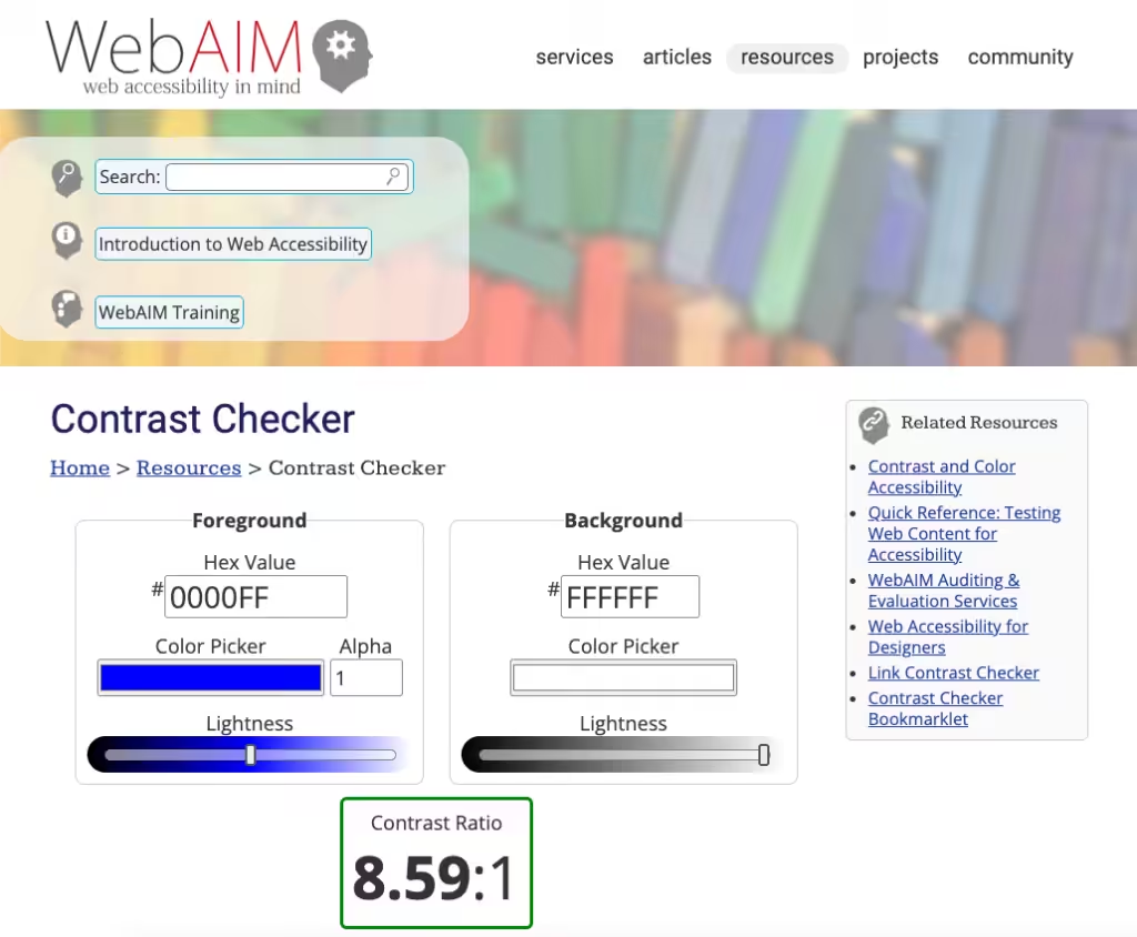
- Use High Contrast: Ensure sufficient contrast between text and background. Tools like the WebAIM Contrast Checker can help.
- Readable Font Sizes: Stick to a minimum of 16px for body text to ensure readability.
- Avoid Decorative Fonts: Opt for simple, sans-serif fonts which are easier to read.
- Adjustable Text: Allow users to resize text without loss of content or functionality.
- Clear Hierarchy: Use headings, subheadings, and lists to break down content.
Tools and Resources
Several tools and resources are available to test the accessibility of typography on websites:
- WAVE Accessibility Tool: This browser extension evaluates the accessibility of web content.
- Colour Oracle: Simulates colour blindness, helping designers see their work through the eyes of those with colour vision deficiencies.
- Accessible Fonts Library: Services like Google Fonts offer typefaces specifically designed with accessibility in mind.
By implementing these best practices and utilising these tools, you contribute significantly towards creating an inclusive digital environment that values the importance of readability in web design.
Visual Hierarchy and Aesthetic Design: Guiding Users with Typography
Typography plays a crucial role in establishing visual hierarchy on a website, directing users' attention to the most important elements first. Effective use of size and weight variations can create a structured visual path that enhances the user's experience.
Size and Weight Variations
- Size: Larger fonts naturally draw more attention. By using larger sizes for headings and smaller sizes for body text, you can guide users through your content in a logical sequence.
- Weight: Bolder font weights can highlight key information or calls to action, making them stand out against regular or light-weight text.
Techniques for Guiding Users
- Consistent Headings: Maintain a clear hierarchy by using H1 for main titles, H2 for subheadings, and H3 for smaller sections. This not only guides users but also improves SEO.
- Contrast: Use contrasting font styles (e.g., serif for headers and sans-serif for body text) to differentiate between various content levels.
- Spacing: Adequate spacing between lines (line height) and letters (letter spacing) ensures readability while helping users scan the content effortlessly.
- Colour Differentiation: Use contrasting colours to distinguish between different types of information, making navigation intuitive.
By thoughtfully applying these typography techniques, web designers can create aesthetically pleasing sites that effectively guide users through the content, enhancing both usability and visual appeal.
Font Pairings: Creating Cohesive Designs with Complementary Fonts
In web design, selecting complementary fonts that work harmoniously together is crucial for achieving a cohesive and visually appealing website. Different font choices can significantly impact a website’s tone, readability, and overall aesthetic. By carefully pairing fonts, designers can create an engaging and memorable user experience.
Importance of Selecting Complementary Fonts
Choosing the right font pairings ensures that each typeface complements the other, enhancing the site's visual coherence. This balance helps maintain a professional appearance while conveying the desired brand personality. For instance:
- Serif Fonts: Often associated with tradition and reliability.
- Sans-Serif Fonts: Convey modernity and simplicity.
Combining these two can create a dynamic yet balanced look.
Tips for Effective Font Pairings
Contrast and Harmony:
- Select fonts with contrasting styles but harmonious proportions.
- Example: Pairing a bold sans-serif heading with a light serif body text.
Consistency Across Devices:
- Ensure font pairings are readable on various screen sizes.
- Adjust line height and spacing to maintain clarity and legibility.
Hierarchy Establishment:
- Use different weights and styles to establish a clear visual hierarchy.
- Example: Bolder fonts for headings, lighter ones for body text.
Test and Iterate:
- Experiment with different combinations.
- Gather feedback to refine choices ensuring both aesthetic appeal and readability.
Font pairings play a pivotal role in shaping how users perceive your website, influencing their engagement levels. Thoughtful typography choices reflect the brand's identity while enhancing user experience through clear, readable content.
The Importance of Typography in Brand Identity: How Fonts Reflect Personality
Typography is a powerful tool in defining brand identity and enhancing brand awareness. Fonts speak volumes about a brand's personality and values.
How Typography Reflects Brand Personality and Values
A well-chosen typeface can communicate the essence of a brand instantly. For instance:
- Serif fonts like Times New Roman evoke tradition, reliability, and formality.
- Sans-serif fonts such as Helvetica suggest modernity, simplicity, and clarity.
- Script fonts convey elegance, creativity, and sophistication.
- Display fonts are often bold and unique, reflecting individuality and flair.
Selecting a font that aligns with the brand’s core values ensures a cohesive visual identity. This alignment helps create an immediate connection with the target audience by visually expressing what the brand stands for.
Successful Brands That Use Typography Effectively
Several well-known brands have leveraged typography to solidify their online presence:
- Coca-Cola uses a custom script font that embodies its heritage and timeless appeal.
- Apple’s use of San Francisco, a clean sans-serif typeface, reinforces its sleek, innovative image.
- New York Times employs a classic serif font that underscores its authority and credibility in journalism.
These examples illustrate how strategic font choices can enhance brand awareness by making brands instantly recognisable and memorable.
The Impact of Typography on Perception
Typography not only adds aesthetic value but also plays a crucial role in shaping perceptions. Selecting the right typeface becomes an integral part of crafting a compelling brand narrative.
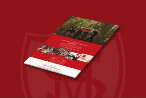
Case Studies from Rubber Duckers' Projects: The Power of Typography in Action
Case studies from our projects provide valuable insights into how thoughtful type selection can significantly enhance brand identity. One noteworthy example is City Estates, a property development company that saw a transformative boost in its online presence.
City Estates: A Typographic Transformation
City Estates approached us with the goal of modernising their website while maintaining a professional and approachable image. We achieved this through:
- Font Selection: We chose a combination of serif and sans-serif fonts to balance tradition with modernity. The serif font conveyed trust and stability, while the sans-serif added a contemporary touch.
- Hierarchy and Readability: By using varying font weights and sizes, we established a clear visual hierarchy. This guided users effortlessly through their extensive property listings.
The result was a 100% annual occupancy rate for their properties since the launch.
Southampton Athletic Club: Energising Through Typography
For Southampton Athletic Club, the challenge was to reflect their energetic and dynamic spirit online. Our team selected bold, sans-serif fonts that exuded energy and movement.
- Dynamic Design Choices: We used large, bold headings paired with ample white space to create an inviting yet powerful aesthetic.
- Responsive Typography: Ensuring readability across devices was critical. Adjustable font sizes and line heights were implemented for seamless user experiences on both mobile and desktop platforms.
This design enhanced patron engagement and significantly increased brand awareness.
These case studies highlight how we leverage typography to not only meet but exceed client expectations, demonstrating the profound impact of strategic font choices on user perception and business success.
Best Practices for Typography in Web Design: Striking a Balance Between Aesthetics and Usability
Typography can significantly influence user perception, affecting the tone, readability, and overall aesthetic of a website. Understanding best practices for typography in websites helps designers create visually appealing yet functional designs.
Key Takeaways on Font Choices
Selecting the right fonts can make or break user experience. Consider these aspects:
- Tone: Fonts convey emotions and set the website's mood. For instance, serif fonts often evoke traditionalism and reliability, while sans-serif fonts suggest modernity and simplicity.
- Readability: Ensuring text is easy to read is paramount. Factors like font size, line height, and letter spacing play crucial roles.
- Aesthetic: Fonts should complement each other and the overall design. Harmonious font pairings enhance visual appeal without sacrificing readability.
Recommendations for Improving Typographic Strategy
To strike a balance between aesthetics and usability:
- Prioritise Legibility: Choose fonts that are easy to read across different devices. Avoid overly decorative fonts for body text.
- Utilise Hierarchy: Create a clear visual hierarchy using size, weight, and style variations to guide users through content seamlessly.
- Consistent Styling: Maintain a cohesive visual style by sticking to a limited number of fonts, typically two to three complementary typefaces.
- Responsive Design: Adapt typography for various screen sizes to ensure consistency in user experience.
Tools and Resources
Leverage tools like Google Fonts for an extensive library of web-optimised typefaces. Explore online communities and courses to stay updated on evolving trends in typography.
The role of typography in web design extends beyond mere aesthetics; it shapes how users perceive and interact with your site. Thoughtful font choices contribute to a cohesive brand identity and an engaging user experience.
Recommended Tools for Designers: Google Fonts and Beyond
Google Fonts stands out as an invaluable resource for web designers. It offers an extensive library of free-to-use typefaces, specifically optimised for web applications. Whether you're seeking classic elegance or modern minimalism, Google Fonts provides a diverse selection to suit any design aesthetic. The intuitive interface allows for easy browsing and experimentation with various font combinations, ensuring designers can effortlessly find the perfect match for their projects.
"Google Fonts is more than just a repository; it's a playground for creativity."

Additional Resources for Continuous Learning
Staying updated with current trends in typography is crucial for maintaining a fresh and engaging web presence. Consider exploring the following resources:
- Online Communities: Platforms like Typewolf and Typography.Guru offer vibrant communities where designers share insights and inspiration.
- Books: Titles such as "Thinking with Type" by Ellen Lupton and "The Elements of Typographic Style" by Robert Bringhurst provide in-depth knowledge on the art of typography.
- Courses: Websites like Coursera and Udemy offer courses tailored to different skill levels, from beginner to advanced.
These tools and resources not only enhance your typographic skills but also ensure your designs remain innovative and user-centric.
Conclusion: Embracing the Artistry of Typefaces in Digital Spaces
Understanding typography's significance within the context of modern web development is crucial. Different font choices can dramatically affect a website’s tone, readability, and overall aesthetic. The right typeface not only complements the visual design but also enhances user experience by ensuring clarity and ease of reading.
Encourage yourself to embrace the artistry of typefaces when designing your own sites. Consider both aesthetic appeal and functional aspects like legibility and responsiveness. A well-chosen font can shape your website's identity, reflecting your brand's personality and values.
Thoughtful selection of fonts can:
- Shape overall identity
- Enhance user engagement levels
- Lead to successful outcomes for a business's online presence
By prioritising typography in your design process, you create a cohesive and immersive experience for users, ultimately driving engagement and success.
In "The Role of Typography in Web Design: How Fonts Impact User Perception," we've seen how different font choices influence various aspects of a website. As you venture into web design, let these principles guide you to make informed and creative typographic decisions that resonate with your audience.
If this article has been useful, let us know!
Typography isn’t just style, it’s strategy. Our Web Design services craft identities that are clear, consistent and memorable.
Find out more
Book a free intro call to talk through your needs.