A Guide to Responsive Web Design
In the ever-evolving digital landscape, having a website that seamlessly adapts to different devices is no longer optional. Responsive web design ensures that your website looks and functions well on devices ranging from mobile phones to desktop computers, encompassing all aspects of design and layout. This guide delves into what responsive web design is, its importance, and how to implement it for various screen sizes.
What is Responsive Web Design?
Responsive web design definition
Responsive web design is a web development approach that creates dynamic changes to the appearance of a website, depending on the screen size and orientation of the device being used to view it. Coined by Ethan Marcotte, the term encapsulates techniques using CSS and HTML to make web pages adapt to a range of devices. It essentially enables a single codebase to run efficiently across different screen sizes, such as tablets, desktop computers, and mobile phones.


The idea behind responsive web design is to have a flexible layout that reflows content to accommodate a user's device, ensuring optimal browser width usage. This design minimises the need for resizing, panning, and scrolling across different devices. With responsive web design, the elements adapt fluidly, ensuring that the viewing experience is consistent and intuitive, regardless of the screen or browser used.
Importance of responsive design
In today's multi-device world, responsive design is crucial for providing a superior user experience across all platforms. As web traffic increasingly comes from mobile devices, having a responsive site can significantly enhance accessibility and usability. Moreover, responsive design improves SEO rankings since search engines like Google prioritise mobile-friendly websites. Thus, it not only ensures better user engagement but also drives more organic traffic.
Responsive designs eliminate the need for multiple versions of a site, such as separate desktop and mobile versions, streamlining the web design and development process. With a single responsive site, updates becomes easier and maintenance is simplified. Additionally, responsive web designs can reduce bounce rates as users are more likely to stay on a website that looks good and functions well on their device. In sum, applying responsive techniques can offer a competitive edge, making your site more versatile and appealing to a broader audience.
Key components of responsive design
The core elements of responsive web design are fluid grids, flexible images, and media queries. Fluid grids allow the layout to adapt to different screen sizes by using relative units like percentages instead of fixed pixel values. This ensures that the design can scale smoothly across varying screen widths. Flexible images, or responsive images, resize within their containing element, preventing them from overflowing or becoming distorted on smaller screens.
Media queries are CSS techniques that apply styles based on the characteristics of the device rendering the content, such as screen width, height, and orientation. These queries allow developers to create breakpoints where the design can change dramatically to accommodate different devices. Implementing these components effectively can transform a static web design into a responsive one, adaptable to any viewing environment.
How to Implement Responsive Design?
Using CSS for responsive layouts
CSS is the cornerstone for creating responsive layouts. By utilising CSS style sheets, web designers can craft layouts that respond to different screen sizes fluidly, adhering to principles of flexible grid use and responsive web design. One common technique is using percentages for width rather than fixed pixel values, creating a layout that is more flexible and adaptable within a flexible grid system. Additionally, employing CSS properties like flex-box and grid enables designers to create complex layouts that can adapt to different devices seamlessly.

With modern CSS techniques, creating responsive layouts has become more intuitive, greatly impacting the field of web design and development. Flexbox, for instance, simplifies arranging items evenly across a page, making it easier to build responsive designs without excessive nesting. Grid layout, another powerful tool, allows for crafting sophisticated, multi-column designs that responsively adjust based on screen width. These techniques in CSS make the design phase more straightforward, encouraging more dynamic and flexible web designs.
Understanding media queries in CSS
Media queries in CSS are vital for implementing responsive design. They allow developers to apply specific CSS rules based on conditions like screen size, device orientation, or resolution, making it easier to create a responsive design. For example, a media query can target devices with a max-width of 768 pixels, making a layout shift from multiple columns to a single-column layout on smaller screens. This adaptability ensures that the design looks optimal across different devices.
Understanding how to use media queries effectively is a key skill for web developers. By pinpointing breakpoints at which the layout changes, media queries enable customisation without altering the HTML structure. They help in changing font sizes, rearranging layouts, and hiding or displaying elements as needed. Mastering media queries empowers developers to create highly adaptable, responsive websites that perform well across a myriad of devices.
Setting viewport meta tag for responsiveness
The viewport meta tag is an essential component for making a web page responsive. It controls the layout on mobile browsers and ensures that the website scales correctly on different devices. By setting the viewport width to the device width, designers allow the page to fit the screen, providing a better user experience. This tag curtails issues like having to zoom in or out to view content properly.
Implementing the viewport meta tag is straightforward yet profoundly impactful. For instance, the meta tag `` instructs the browser to set the width of the webpage to the device’s screen width initially scaled at 100%. Developers who incorporate this tag enable their web content to adjust responsively, making the site more accessible and enjoyable to explore on various devices, from smartphones to desktops.
Designing for Different Devices
Creating layouts for tablets and mobile phones
When designing for tablets and mobile phones, considerations of screen size and user interaction are paramount in effective web design and development. Unlike desktops, tablets and mobile devices have smaller screens and are often used in portrait orientation. This requires a design that prioritises readability and ease of navigation. Layouts should switch from multiple columns to a single-column format to provide a clean, uncluttered experience.
Adapting web designs to fit the dimensions and unique aspects of mobile devices improves user experience significantly. Using touch-friendly elements and sufficient spacing ensures that users can interact with the site without accidentally triggering unwanted actions. Dropdown menus, collapsible sections, and larger touch targets can help create a more intuitive interface. Focusing on these details enables a seamless and engaging experience for users on tablets and mobile phones.
Optimising images for various screen sizes
Optimising images for different screen sizes is a crucial factor in responsive web design. Large, unoptimised images can dramatically slow down load times, especially on mobile devices with slower internet connections. Using responsive images allows for different versions of an image to be served based on the device's screen size and resolution. This not only improves loading times but also enhances the overall user experience.
Techniques such as the srcset attribute in HTML allow developers to specify multiple image sources for different devices. By doing so, high-resolution images can be displayed on larger screens, while smaller compressed versions are served to mobile devices, ensuring that images don’t slow down loading times. Optimising images through such methods ensures that visuals maintain their quality without compromising the performance or speed of the website across various devices.
Utilising fluid grids for responsive web design
Fluid grids are central to creating responsive web designs. Unlike fixed grids, which use static-sized columns, fluid grids use relative units like percentages to define the width of columns, contributing to a more flexible grid layout. This flexibility ensures that web layouts adapt smoothly to any screen size, from large desktop monitors to smaller mobile screens. A fluid grid reflows content in a way that feels natural and cohesive.
Incorporating fluid grids involves defining columns flexibly within a CSS style sheet, allowing elements to resize dynamically. This adaptability supports a seamless transition between different screen widths, thus enhancing user experience. By utilising fluid grids, web designs become more resilient and future-proof, capable of meeting the demands of an ever-expanding range of devices in our increasingly digital world.
Examples of Responsive Web Design
Showcasing responsive website examples
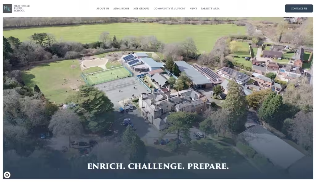
There are numerous compelling examples of responsive websites that illustrate best practices in web design. Websites like BBC and Airbnb have masterfully crafted responsive layouts that automatically adjust to different screen sizes. These sites employ a combination of fluid grids, flexible images, and well-implemented media queries to ensure a smooth user experience across all devices. Observing these examples can provide valuable insights for anyone looking to enhance their own responsive web design skills.
Analysing responsive website examples helps understand the practical application of theoretical concepts. For instance, examining how these sites handle navigation menus, image scaling, and content prioritisation across devices can offer ideas for improving your own website. Detailed breakdowns of responsive elements reveal how to overcome challenges and implement solutions effectively. These case studies serve as a visual guide to mastering the art of responsive web design.
Implementing breakpoints for responsive layouts
Breakpoints in responsive design are specific points where the site's layout shifts to accommodate different screen widths. Choosing breakpoints strategically is essential for creating a seamless experience across various devices. Common breakpoints include ranges that target mobile devices, tablets, and desktop screens, such as 480px, 768px, and 1024px. By setting these parameters, web developers can adjust layouts to ensure content is always displayed optimally.
Implementing breakpoints effectively requires thorough testing and consideration of the most common devices used by your audience. Using CSS media queries to define these breakpoints allows for tailoring layouts and styles to different screen sizes. This ensures consistency and usability, no matter where the website is being accessed. Careful planning and implementation of breakpoints can elevate a site’s responsiveness, offering a unified user experience across the entire range of devices.
Enhancing user experience through responsive images
Responsive images play a significant role in enhancing user experience on a website, which is a crucial aspect of website design. By adapting images to various screen sizes, the website ensures that users are always presented with high-quality visuals, regardless of the device they are using. This approach prevents issues like slow loading times and poorly rendered images that can mar the user experience, enhancing the overall design and layout of the website. Techniques such as using `srcset` and `` elements in HTML allow for serving the most suitable image version based on screen width and resolution.
Optimising and resizing images for different devices can greatly improve a website’s performance. For instance, smaller, low-resolution images can be served to mobile devices, while high-resolution images are reserved for larger screens. This not only enhances visual appeal but also contributes to faster loading speeds and a smoother browsing experience. Implementing responsive images is a crucial practice in modern web development that can significantly boost user satisfaction and engagement.
If this article has been useful, let us know!
Every device, every time. Our Web Design Hampshire services ensure your site looks sharp everywhere.


