Strategy & Brand
What good web design actually looks like in 2026
Most "web design trends" posts are forgettable. This is the opposite: six principles we keep seeing work in 2026, why they matter, and what they look like when done well.
Web design in 2026 feels different. Everything’s a bit faster, cleaner, and more human than it was last year.
AI tools, performance thinking, and accessibility rules have raised the bar for what passes as professional work. You can’t just rely on flashy graphics or clever code anymore.
Clarity, speed, and user-focused experiences set the tone now. Sites use bespoke layouts built around real content, and motion guides you rather than distracts.
Visual storytelling through photo and video feels more honest, showing the brand’s real side. Modern web design trends favour sites that load instantly, pass Core Web Vitals, and feel inclusive from the start.
This article digs into what good web design actually looks like right now. Layout, typography, AI-driven personalisation, visuals, and how scalable design systems actually play out in the wild.
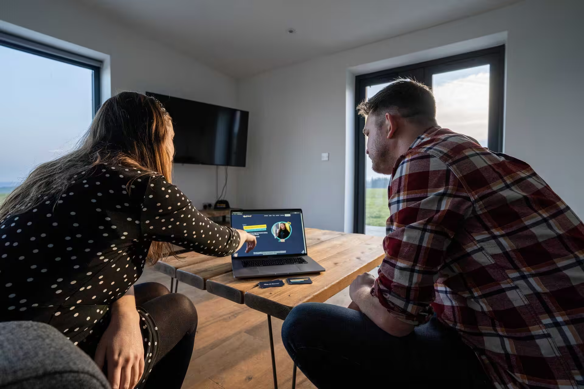
We’ve built sites across Hampshire and beyond using these principles. I’ll walk through the decisions that separate working websites from those you forget about.
Defining good web design in 2026
Good web design in 2026 means cutting the noise and building sites that actually work. The focus has shifted to speed, clarity, and layouts that put content first.
Clarity over effects
Modern web design cares more about legibility and purpose than decoration. Organic shapes and soft gradients show up, but only if they help you read or find what you need.
We’ve seen this in recent builds. Sites that used to hide navigation behind a hamburger menu now put key actions right in front of you.
Forms that once sprawled over several steps now fit onto a single, scannable screen. The visual trend towards softer, friendlier aesthetics only works if it doesn’t hide the message.
Curved edges and flowing layouts can make a brand feel approachable. If users can’t find a phone number or figure out what the business does, it’s failed.
Colour contrast matters more than before. WCAG compliance is now law in many places, and poor contrast just makes text harder for everyone.
Performance as table stakes
Core Web Vitals have become baseline. Google rewards faster sites, and users bail on slow ones before anything loads.
We choose lighter elements from the start. That means optimising images before upload, skipping heavy animation libraries, and writing clean code that doesn’t weigh the page down.
Last year, we rebuilt a client’s photography portfolio. Homepage load time dropped from 4.2 seconds to 1.1 seconds after switching to next-gen image formats and lazy loading. Organic search traffic jumped by 34% in three months.
Speed is now a design decision. Layouts that look impressive but take ages to load on mobile just don’t cut it.
Purposeful, functional layouts
Content-first layouts put what users actually need up front. Navigation is direct, sections follow priority, and white space serves a reason rather than just filling gaps.
We usually start by mapping user journeys before opening any design tools. A Hampshire hospitality client needed to attract corporate event planners, so their homepage now leads with capacity, location, and booking info right away.
Anti-grid layouts show up more often now, but they still follow logic. Breaking the grid works if it draws attention to key content or adds visual rhythm. If it confuses people, it’s missed the point.
Content-first layout doesn’t mean plain. It means every visual choice backs up the message.
Combining photo, video and bespoke creativity
Good design in 2026 leans on original visuals made for the brand, not plucked from a stock library. Hampshire businesses have seen how custom photography, video, and illustration give them a look that’s unmistakably theirs.
Real examples from Hampshire projects
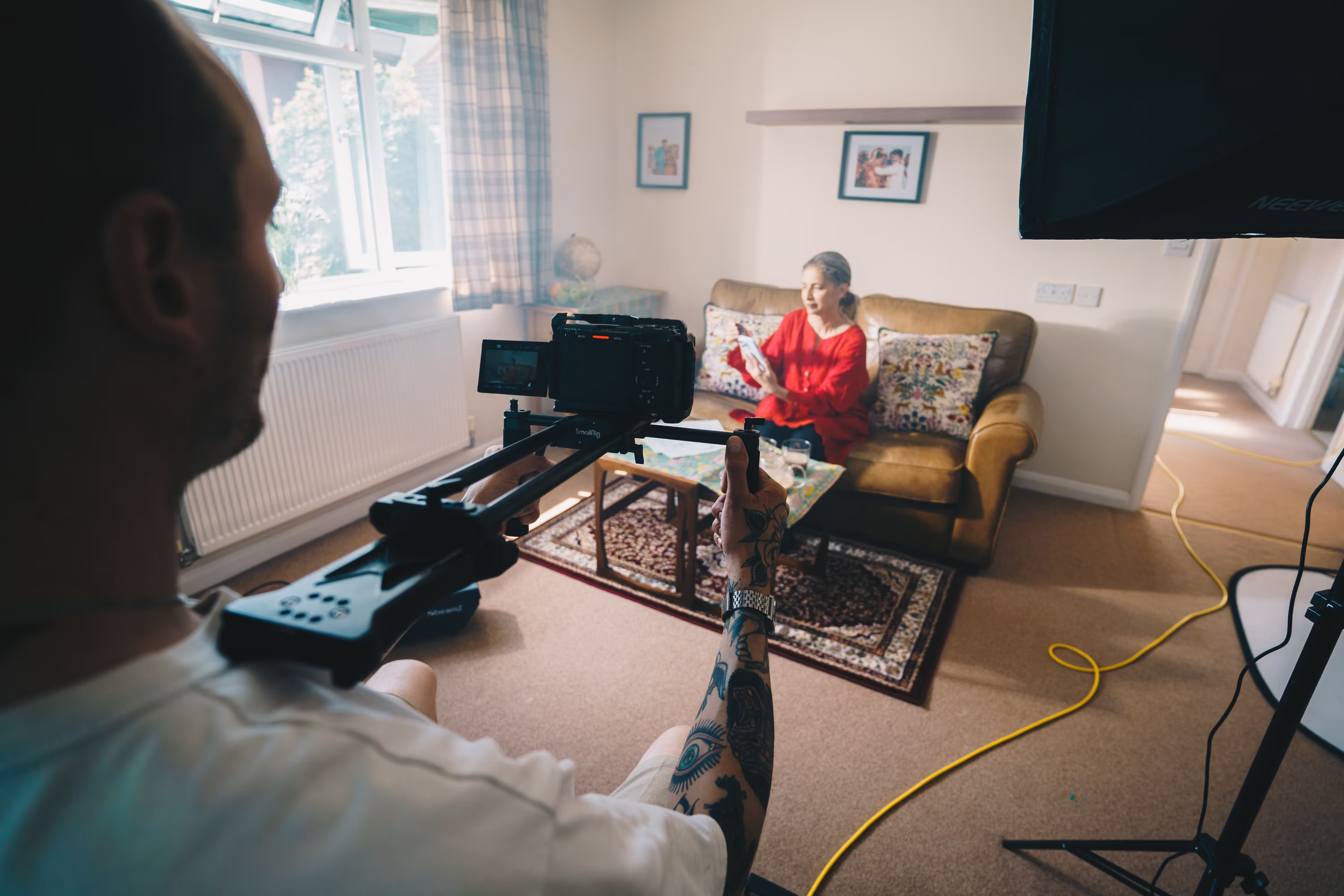
For a Winchester property developer, we hired a photographer to shoot their finished homes at golden hour. The photos showed real spaces, with genuine light and materials.
We added short video walkthroughs filmed on site. Each one ran about 15 seconds, showing someone walking through the entrance, kitchen, and out to the garden.
That mix gave buyers a sense of space that neither photos nor video could deliver alone. For a Southampton café, we brought in an illustrator for hand-drawn menu boards and food icons.
Those illustrations appeared across their website, emails, and menus. No other café in town could copy that style.
Photography that feels authentic
Stock photos all start to look the same. A library team photo feels generic, and visitors notice.
We suggest hiring a photographer who gets the brief. For a Basingstoke manufacturer, we set up a half-day shoot on their factory floor. The photos captured workers at their stations, close-ups of hands assembling parts, and wide shots of the warehouse.
Those images now sit on service pages and case studies, showing the real work. Authentic photography means skipping the over-styling too. We’ve found that natural light, actual team members, and real spaces beat heavily retouched studio shots every time.
Video for storytelling and clarity
Video shines when it explains something tricky. We used it for a Hampshire SaaS client to show their onboarding flow. A 90-second screencast with voiceover cut support tickets by showing new users exactly what to do.
For a Farnborough consultancy, we filmed a two-minute interview with their managing director about their process. The video sat at the top of their About page, giving clients a sense of who they’d be working with.
Video doesn’t need to cost a fortune. We’ve shot plenty with just a camera, a lapel mic, and a window for daylight. The content matters more than the kit.
Commissioned illustration and custom visuals
Illustration fills gaps where photos can’t help. A Hampshire health tech client needed to explain a multi-stage diagnostic process, so we brought in a medical illustrator to draw a clear, connected diagram.
Custom illustration lets you set the tone. For a children’s charity, we worked with an illustrator who used warm colours and soft shapes. That style made complex safeguarding info feel less intimidating.
AI-generated visuals are popping up more often. We’ve tried them for mood boards and early ideas, and they’re handy for quick concepts but still feel a bit generic. We haven’t used them on live sites yet. They just lack that specific, human touch.
Dynamic content has its place too. For a Portsmouth retailer, we set up a system that automatically pulled product images into templated layouts. The design stayed consistent, and new products showed up without anyone having to tweak the site manually.
Layout trends: Content-first, bento grids and anti-grid details
Websites in 2026 are drifting away from rigid templates. Layouts now start with the content, then use modular systems like bento grids or break out into organic shapes if it helps the message land.
Content-led structure
A content-first layout means the design fits what you actually want to say, not the other way around. We see this most with service and landing pages for Growth Partner clients.
The structure changes based on whether you need a portfolio, a pricing table, or a deep dive into how something works. You plan the hierarchy before you touch any design tools. Map out the main message, supporting points, proof, and calls to action in plain text. Then build the layout around that order.
It’s slower at first, but you get fewer revisions later since the page matches what visitors actually want. We rebuilt a client’s feature comparison page this way in early 2026, and bounce rate dropped by 19% in a month.
Bento grid designs
The bento grid splits content into rounded tiles of different sizes. Bigger tiles show what matters most, smaller ones hold details or visuals.
This format works for dashboards, SaaS homepages, and portfolios. We’ve used it to present case studies, logos, testimonials, and feature lists in a single, scannable block. The layout stays tidy without loads of heavy fonts or too much white space.
Bento grids use CSS Grid with container queries to stay responsive. Each tile adapts to its container, so the layout doesn’t fall apart on mobile. Rounded corners usually sit between 12px and 24px, and spacing stays tight across breakpoints.
Scan speed improves. Users find what they need faster than scrolling through endless sections.
Organic and anti-grid details
Organic shapes, curved dividers, and offset elements break up strict grid layouts. These touches often show up in hero sections, testimonials, or between main content blocks.
We use subtle backgrounds or abstract blobs sparingly. They add interest but don’t steal focus. Overdoing it just adds noise and slows things down.
Anti-grid moves include uneven column widths, overlapping images, or text slightly off-centre. These touches make a layout feel crafted, not templated. One or two well-placed breaks are enough to shift the mood.
Motion done right: subtle, purposeful, and human
Good motion design in 2026 barely draws attention to itself. The best sites use micro-animations to guide your eye and confirm actions. Kinetic typography adds a bit of rhythm, but never shouts for it.
Micro-interactions vs. animation overload
Micro-interactions are those tiny animated cues you get when you hover over a button, submit a form, or scroll past a section. They show the site is paying attention.
If a button shifts colour on hover, or a form field gives a quick shake when you miss a required entry, that’s the site confirming what you just did or telling you something’s off. These little animations take a blink and feel right because they work like objects do in the real world.
Animation overload hits when every bit of the page tries to grab you at once. Text zooms in from all sides, images start pulsing or spinning, and the homepage feels more like a slideshow than a website. People get lost in the chaos and miss what they came for.
You only need a single button animation per action. If everything moves at once, it’s just noise.
Kinetic typography in context
Kinetic type is text that moves or changes as you interact. It works best when it backs up the message or points you to something important.
We once built a landing page for a Hampshire fitness studio where the headline shifted weight as you scrolled, matching the energy of the programme. The motion felt tied to the story, not just for show.
Kinetic type goes wrong when it moves just to move, or when it slows people down. If you have to wait for a word to finish animating before you can read, that’s just getting in the way. Text should move to help, never to fill space.
When to use motion and when to remove it
Use motion to show state changes, direct focus, or confirm something happened. A loading spinner means the site’s working. A smooth scroll to an anchor shows you where you landed. A menu that slides open makes it clear what’s changed.
Cut motion if it doesn’t help the user or if it slows things down. We removed all entrance animations from a client’s product pages after seeing a 0.4-second delay. The page felt snappier straight away, and bounce rate dropped.
Test your animations on real devices. Animations that glide on a fast desktop can stutter on old phones or slow connections, making the whole thing feel broken.
Typography in 2026: Bold, expressive and readable
Typography in 2026 is all about scale and personality. Designers are going for oversized type as structure, adding motion when it helps, and balancing impact with real accessibility.
Oversized headlines with intent
Big type isn’t just a style move. We use oversized typography to build hierarchy, grab attention, and break up long pages.
It’s practical. Headlines anchor the page, helping visitors scan quickly. When we rebuilt the Household Cavalry Museum site, oversized headings split up dense historical content without extra graphics or lines.
Bold type works when it has a reason. That means pairing big display fonts with clear, readable body text, using size to highlight messages or calls to action, and skipping decorative size bumps that don’t help anyone.
Expressive and animated type
Kinetic typography is popping up more, especially on landing pages and hero sections. You’ll see subtle letter animations, hover states that shift weight, and scroll effects that reveal headlines as you scroll.
Expressive type is a response to what some call “sameless” design, where every brand uses the same safe sans-serif. Fonts with real character are giving sites more personality.
We keep kinetic type sparse. One animated headline in a hero section is enough. More than that and it gets messy. The best kinetic type we’ve done this year was for client project pages, where the title animates in once and then stays put.
Balancing boldness with accessibility
Big, expressive type still needs to meet WCAG. That means keeping contrast ratios strong, avoiding see-through overlays on images, and making sure animated type doesn’t set off vestibular issues.
We test every big type treatment at different screen sizes. A 120px headline might look great on desktop but break mobile layouts if you don’t tweak line height or spacing.
Readable type isn’t about playing it safe. It’s about smart choices that work for everyone. We pair expressive display fonts with proven body faces, keep paragraphs between 50 and 75 characters wide, and use font sizes that make heading levels clear.
Dark mode, soft gradients, and colour trends
Dark mode is now standard, so colours have to work on both light and dark backgrounds. Gradients have shifted from loud rainbows to soft, useful layers that guide the eye.
Dark mode as baseline experience
We build dark mode in from the start. It’s never just a colour invert or an afterthought.
The approach is different now. Instead of pure black, we use deep charcoals like #0B0D10 or #151A21. These softer tones cut eye strain and keep text at #E9EEF5 or similar easy to read for longer sessions.
Contrast ratios still matter. We aim for 4.5:1 as a minimum for standard text, which keeps things readable without killing the mood. For the athletic club sites, we tested dark mode early so fixtures and stats stayed clear in both themes.
Buttons and links need real contrast to pop. Electric cyan at #40E0FF or similar bright accents work well on charcoal, without feeling harsh. We avoid grey-on-grey designs that just fade away.
Soft gradients and functional colour contrast
Gradients in 2026 feel like ambient light. We use them to break up sections, add depth to hero areas, and highlight key bits without the sharp transitions of past years.
The palette is smoky and blurred. A typical gradient might go from #2B1538 through #5A4B8A to #88A3D6, giving a glow that feels cinematic rather than flat. These gradients sit behind text or images, adding mood without shouting for attention.
We keep gradients subtle and on purpose. On the FH Power Consultants rebrand, we used a soft teal-to-navy gradient in the header to ground the energy sector identity, then kept the rest of the layout neutral so the message stayed front and centre.
Colour contrast is still a must. Even with gradients, text and buttons need to stand out. We test every layout in greyscale first to make sure the hierarchy works without colour.
Colour tokens in design systems
Colour tokens have replaced fixed hex codes. We set base colours, semantic roles, and theme variations as tokens that work everywhere on the site.
A token system might cover surfaces, borders, text, and accents. For instance, --colour-surface-base could be #F0EEE9 in light mode and #151A21 in dark, all controlled by one variable that updates across the board.
This makes maintenance easier. If a client tweaks their palette, we change the tokens once instead of digging through stylesheets. It also means accessibility stays consistent, since contrast rules are baked into the tokens.
We used this on a Hampshire ecommerce client’s product catalogue. The token system let us roll out seasonal promotions across the full product range without breaking the UI or accessibility.
Accessibility and inclusive design without compromises
Accessible design isn’t some side project or legal box to tick. It’s the foundation that makes everything work better, from SEO to user trust to conversions.
Keyboard navigation and hover states
Every interactive element has to work without a mouse. Forms, navigation, modals, carousels, and custom dropdowns all need to respond to tab, enter, space, and arrow keys.
Focus states show where you are on the page. If you can’t see them, keyboard users get lost. We check this by unplugging the mouse and trying to complete a task. If it fails, the design isn’t ready.
Hover states help, but can’t be the only feedback. Touch screens don’t have hover. Screen readers won’t pick up colour changes. If something crucial only appears on hover, some people will never see it.
WCAG 2.2 has a rule called Focus Not Obscured. Sticky headers, cookie popups, and chat boxes often cover up the focused bit. That’s a fail, even if the code looks fine.
Logical structure and schema markup
Semantic HTML does most of the heavy lifting. Headings should go in order, with one H1 per page and H2s for each section. Links should say where they go. Buttons should make it clear what happens when you click.
Schema markup helps search engines and assistive tech understand what’s on the page. If you mark up a product, event, or business properly, that data shows up in search and gets picked up by screen readers.
We use schema for ecommerce and event listings because it helps both users and crawlers. It’s the same info, just packaged for people and machines.
Visual clarity for every user
Contrast is key. Text under 4.5:1 against its background is tough to read in sunlight, on old screens, or for people with low vision. Buttons, icons, and focus rings need at least 3:1.
We check contrast early, before locking in components. Fixing it later usually means changing brand colours or layouts, which is a pain and costs more.
Layouts should hold up under browser zoom up to 200%. Text needs to reflow without horizontal scrolling. Controls must stay big enough to tap on phones. If the design only works at one size, it’s too fragile.
We’ve rebuilt sites where the old version looked neat but failed every zoom test. The new build uses flexible grids, relative units, and tested components. It works for more people and ranks higher because Google can read it better.
AI-driven tools, automation and personalisation
Search engines now answer questions directly, content shifts based on location and behaviour, and layouts adapt to each visitor. These changes mean sites have to be built differently and deliver more than before.
AI search and direct answers
Google and other search engines now give answers right on the results page, no click needed. AI-driven search grabs info from sites and puts it in featured snippets, knowledge panels, or AI-made summaries.
This shift means you have to structure content differently. Pages should answer key questions clearly and early, not buried deep. If someone searches “web design Hampshire pricing”, they want a price or range in the first paragraph, not after scrolling forever.
We write service pages so the most common questions get answered in the first 100 words. When we rebuilt a consultancy site in Hampshire, enquiries went up by 34% after we changed the structure to fit real search behaviour.
Schema markup helps search engines get what your page is about. Mark up FAQs, services, reviews, and local business details so AI search can pull the right info straight from your site.
Geo and dynamic content
Dynamic content changes depending on who’s visiting. Location is the most common trigger. Someone from Southampton might see different case studies or imagery than a visitor from London.
Geo-targeting works well for service businesses. We use it to show relevant projects and testimonials based on where the visitor is. A Hampshire visitor sees Hampshire clients, and someone from Bristol gets Bristol work.
Cloudflare Workers and server-side personalisation let you serve different content without slowing the site. Heavy JavaScript usually just gets in the way and delays what people see.
Dynamic content can also mean time-based offers, messages for returning visitors, or landing pages for specific industries. One client uses it to show different CTAs for first-timers versus repeat visitors. Their conversion rate went up by 19%.
Personalised layouts and AI-generated visuals
AI tools now suggest layout tweaks, generate design ideas, and create visuals tailored to users. Tools like Framer and 10Web use AI to adapt templates based on your setup answers.
AI-generated visuals range from backgrounds to icons. These tools speed up early production, especially for placeholders or quick prototypes. We use them for wireframes and swap in real photography or video for the final build.
Personalised layouts shift based on what people do. If someone checks pricing three times, the next visit might show a big pricing CTA. If they read case studies, the contact form might move up the page.
AI-generated design can look bland if you overdo it. We use AI tools for speed, but always mix in custom design and real photos to keep the brand identity alive. On a recent Winchester project, we used AI for the wireframes, but replaced every visual with on-location photography.
Human judgement still matters. AI suggests ideas, but designers decide what fits and what works for the audience.
Performance first: Core Web Vitals and speed
Good web design in 2026 starts with performance. Modern frameworks, efficient assets, and regular testing keep sites loading fast, responding quickly, and looking stable on any device.
Modern frameworks and asset optimisation
We build sites using frameworks that send less JavaScript to the browser. That means faster loads and snappier clicks and scrolls.
Code splitting breaks up big scripts so only what’s needed loads. This cuts wait times and improves Interaction to Next Paint (INP), which tracks how fast a site responds to actions. Sites that passed old metrics like First Input Delay often fail INP now, since they weren’t built for lots of interactions.
We preload key assets like hero images and fonts. A quick code tweak tells the browser to grab the biggest image first, usually improving Largest Contentful Paint (LCP) by 30 to 50 percent. WebP and AVIF formats keep file sizes down without losing visible quality.
Server response time is just as important as front-end code. If your server takes two seconds to reply, no optimisation will save your LCP score.
Lightweight motion and images
Every image should have width and height set. If not, the layout jumps as things load, which tanks your Cumulative Layout Shift (CLS) score and annoys users.
Use CSS transforms and opacity for animations, not properties that force layout recalculations. Micro-interactions and smooth scrolling look great, but only if they don’t block the main thread or slow down clicks.
We lazy-load images below the fold so the browser focuses on what’s visible first. Third-party scripts, especially ad and tracking scripts, usually cause the worst slowdowns. Removing a handful of them often improves INP more than fancy code tweaks.
Reserve space for ads, embeds, and dynamic content before they load. If you inject elements above existing content, everything shifts and users end up clicking the wrong thing.
Performance audits and measurable results
Lab tools like Lighthouse spot technical issues, but real-user data from Chrome UX Report (CrUX) shows how your site actually runs. A PageSpeed score of 95 doesn’t matter if users still get slow interactions on mobile.
| Metric | Good score | What it measures |
|---|---|---|
| LCP | ≤ 2.5s | Loading speed of main content |
| INP | ≤ 200ms | Responsiveness to all user actions |
| CLS | ≤ 0.1 | Visual stability during page load |
We track core web vitals weekly with Search Console and CrUX data. Even small changes, like a new plugin or theme update, can cause performance drops that hurt rankings and conversions. Treat speed as an ongoing thing, not a one-off fix.
Sites at the top of Google have about 10 percent higher Core Web Vitals pass rates than those further down. On mobile, only around 48 percent of sites pass all three metrics, so there’s a clear edge if you do.
Harnessing 3D, WebGL and advanced visuals
Three-dimensional graphics on the web have gone from novelty to real performance driver. Sites with interactive 3D elements consistently show higher engagement and longer sessions than flat alternatives, with some studies reporting up to 70% more time on page. The tools are finally up to the job.
WebGL and no-code 3D tools
WebGL handles 3D rendering in the browser by tapping into the GPU. It uses vertex shaders for geometry and fragment shaders for colour and lighting.
Three.js wraps WebGL’s complexity into a friendlier JavaScript library. You set up scenes, add objects, tweak lighting, and animate without raw shader code. It’s still coding, so you need developer time.
No-code platforms have changed things. Spline and Unicorn Studio let designers build 3D web experiences without writing JavaScript. Both export lightweight WebGL scenes you can embed into most sites. We’ve used Spline on projects needing floating product renders or interactive branding. Quality is good, and files compress enough for real sites.
Spline, Unicorn Studio, and real-world use
Spline feels like Figma for 3D. You model, texture, animate, and export straight to web. The browser-based interface is easy for designers, and collaboration is simple. We’ve dropped Spline scenes into marketing pages for Hampshire clients who wanted standout portfolios without a full 3D rebuild.
Unicorn Studio focuses on interactive animations and scroll-triggered 3D. It’s strong for hero sections and product showcases that need to sync with scrolling.
Both platforms export optimised code you can drop into a React component or WordPress page. This makes them practical when budgets don’t stretch to custom WebGL.
Balancing 3D, accessibility, and load times
3D assets can be heavy. A Spline scene might add 500KB to 2MB, depending on model detail and texture quality. This matters on mobile, especially where 4G is patchy.
We compress textures, keep polygon counts low, and lazy-load 3D below the fold. Preloading key assets helps avoid delays, and a reduced-motion toggle respects user and accessibility needs.
Screen readers skip 3D canvases unless you add semantic HTML. We write text descriptions for visuals and make sure 3D controls work with keyboards. WCAG 2.2 still applies, even with floating geometry.
We watch frame rates, interaction lag, and bounce rates on 3D-heavy pages. If mobile users leave quicker than before, we scale back or drop the 3D.
Design systems, tokens and consistency at scale
Big projects need a shared framework that keeps interfaces predictable and delivery quick. Design tokens turn brand rules into reusable variables, and documented systems help bespoke builds stay solid as they grow.
Design systems that cut rework
A design system is a library of reusable parts, patterns, and rules in one place. Instead of rebuilding navigation or forms for each new section, we use a single source of truth. This saves effort and keeps things consistent across hundreds of pages.
We store components like buttons, cards, and accordions in libraries. Each comes with code, usage notes, and accessibility guidance. Pattern libraries handle layouts like product grids or navigation.
On the Southampton Athletic Club platform, the component library let us roll out consistent event pages, volunteer profiles, and training without starting from scratch.
Design tokens for colour, type, and motion
Design tokens store visual choices as named variables: colours, type scales, spacing, shadows, and animation timings. Instead of hardcoding #003D5B everywhere, we use brand-primary once. If the palette changes, update the token and the whole site updates.
Tokens make dark mode and other themes possible without doubling up stylesheets. We set up token sets for light and dark, then swap them at runtime. Typography tokens cover fonts, sizes, weights, and line heights. Spacing tokens keep margins and padding consistent.
Motion design uses tokens for easing, duration, and delay. We set standard transitions for things like button hovers and modal slides. This keeps animations feeling tight and unified, even when different designers work on the build.
Delivering reliability on bespoke builds
Bespoke projects usually kick off with unusual requirements, custom features, or tricky integrations. A design system helps keep those builds from turning into isolated interfaces that cost a fortune to maintain.
We tweak the component library to suit each project, then share any improvements back into the main system. On a custom ecommerce job for a Hampshire retailer, we added product filtering, comparison tables, and new checkout flows.
The design tokens managed responsive breakpoints and kept the new bits in line with the brand. When the client wanted a seasonal rebrand, we just updated six colour tokens and the whole catalogue changed with it. That felt surprisingly smooth.
We document every custom component with diagrams, interaction states, and code examples. This way, future developers can jump in and extend or tweak things without having to guess past decisions.
Version control keeps tabs on changes, and release notes explain what broke, what improved, and what dependencies shifted.
The hardest part of getting any of this right is being honest about which of the six your site is currently failing on. If you’d like an outside view from someone who looks at a lot of sites in a week, we can take a quick look and tell you which one is costing you the most.
Book a free intro call to talk through your needs.
If this article has been useful, let us know!
The hardest part of getting any of this right is being honest about which of the six your site is currently failing on. If you’d like an outside view from someone who looks at a lot of sites in a week, we can take a quick look and tell you which one is costing you the most.
Book a free intro call to talk through your needs.