Strategy & Brand
Signs your website is costing you customers and how to stop the leak
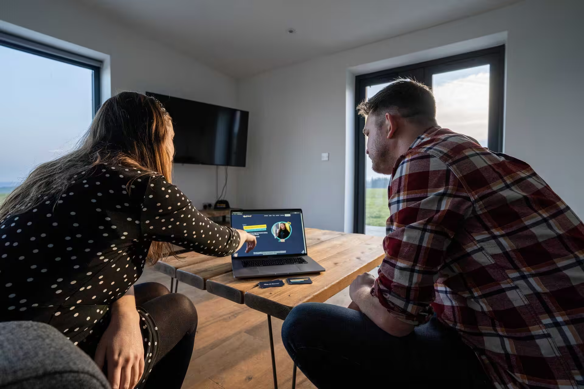
For marketing managers at growing businesses, a slow, outdated website can quietly drive away new customers. This post outlines five clear signs your site may be due for a full redesign - and how a strategic revamp can help win back those lost leads and conversions for your business.

Your website might look alright at first glance. The pages load, you’ve got contact details, and everything seems to work.
But a site that did the job when you had ten clients and one main service can quietly fall behind as your business grows. It sits there looking professional while potential customers show up, poke around for half a minute, and leave without saying hello.
Most businesses only spot the problem when someone mentions that new leads have slowed down. We see this a lot: companies with solid marketing, referrals, and search rankings, but the number of enquiries just doesn’t add up.
The website turns into the bottleneck in an otherwise tidy setup. It still looks fine, so it gets ignored for months, sometimes years.
Sign 1. Pages drag when your connection isn't the problem
Your internet speed tests fine, but your site’s still slow. Visitors spot this straight away and most won’t wait around.
The delay usually comes from how your site is built. Oversized images slow things down. Cheap hosting can’t keep up. Page builders often load loads of code you don’t need.
Tools like Google PageSpeed Insights and Chrome DevTools show where things are stuck. Check your Core Web Vitals, especially LCP (Largest Contentful Paint) and INP (Interaction to Next Paint).
These numbers show whether people see your content quickly or sit waiting. Caching and browser caching help returning visitors load pages faster. A content delivery network (CDN) serves files from servers closer to your users.
TinyPNG compresses images without much quality loss, and WebP format usually beats JPEGs for performance. Reliable hosting matters more than most realise.
Cheap shared servers cause slow response times, and no amount of image tweaks will fix that. If your bounce rate’s high, chances are people gave up before your content even loaded.
Sign 2. Your website feels cheaper than your actual service
Your business has grown. The team’s stronger, clients are better, your work’s sharper. But your website still looks like it did three years ago.
This creates a problem. When someone lands on a site with outdated design, poor typography, or layouts that feel old, they notice. It doesn’t match the quality you deliver now.
The mismatch between your online look and your real service confuses people. They expect one thing based on your website, then get something much better if they stick around. That gap makes them hesitate before getting in touch.
Bespoke Labels had this problem. Their old site brought in people after cheap and fast. After a redesign, they started attracting clients who wanted custom work and paid for it.
Common mismatches that damage credibility:
- Colour schemes and layouts that haven’t changed since 2019
- Fonts that are a pain to read on a phone
- No SSL or security indicators
- Missing case studies or proof of recent work
- Stock photos instead of real project shots
A redesign should make your site fit who you are now and who you want to work with next. Good fonts, proper spacing, and a clear structure all show you take your work seriously.
Sign 3. Mobile annoys people, or makes you look unprofessional
Most visitors show up on their phone. If your text is tiny, buttons are fiddly, or things break on small screens, they’re gone.
A proper rebuild starts with responsive design and mobile-first indexing. That means bigger tap areas, simpler menus, and a faster route to booking or enquiry forms.
When we rebuilt the Household Cavalry Museum site, mobile was the main focus. Visitor enquiries went up because people could actually use it.
Test your main service page on your phone. Try filling in your contact form with one thumb. If it’s awkward or slow, you’re losing customers to sites with better mobile usability and accessibility.
Sign 4. Visitors can't work out what you do, who you help, or where to go next
This one slips under the radar. Your team knows the business, but your site doesn’t explain it well.
A vague homepage makes people guess. Service pages that read like internal notes leave visitors confused. No one should have to dig through three pages just to work out if you’re relevant.
Common things that trip people up:
- Navigation that uses your internal terms instead of what customers search for
- Missing calls to action on important pages
- Passive language where you need strong prompts
- No clear next step after someone reads your stuff
The UX should guide people forward. Book a call, request a quote, download a guide, whatever fits. For the Household Cavalry Museum, we made the ticket path obvious on every page, which helped their online sales.
Site structure matters. If your CTA buttons blend in or use weak language, conversion rates drop. Every page needs a clear CTA that tells people what to do and why.
Sign 5. High volume, wrong fit
You might have a busy inbox and still have a positioning problem. If most enquiries are for stuff you don’t do, prices you don’t offer, or services you’ve moved away from, your website’s attracting the wrong crowd.
This usually means unclear messaging or badly defined landing pages. Your site might rank well in Google Analytics 4, but if the traffic doesn’t match your ideal client, conversion tracking will show the gap between form submissions and real sales calls.
Bespoke Labels saw this. Before the rebuild, they sent out hundreds of sample packs to businesses that just weren’t a good fit. After launching targeted landing pages with clearer positioning, the quality of enquiries improved. Fewer requests, but more of them turned into actual sales because the right people were filling out the forms.
Your website should filter as much as it attracts.
Time for a redesign?
If two or three of these signs sound familiar, you’re probably past the point where small tweaks will help. A full redesign lets you rebuild things properly, clear up messaging, and make something that works with your marketing, not against it.
Start with a site audit. Run your pages through Google Search Console to spot broken links, indexing issues, and pages that aren’t showing up in search. See where your site’s lagging and what content you actually need.
The rebuild works best if you follow the right order: goals, audience, user journeys, content, design, then build. We did this for Bespoke Labels and turned visits into more enquiries. Their rankings improved in two months, partly because the site audit shaped what we built and the website optimisation matched how people used it.
Stop losing customers through your website
We can rebuild your site with clear structure and design that fits the business you run now.
Common questions
At what load time do you start losing visitors?
If your site takes more than three seconds to load, you’ll lose about half your visitors before anything even appears. We see this in analytics over and over.
Google says the sweet spot is under two seconds on mobile. Each extra second after that bumps bounce rate up by around 30 per cent.
If your homepage takes five seconds, most people who clicked from search or social have already left. They’re back on Google clicking your competitor instead.
We rebuilt the Household Cavalry Museum site with mobile speed in mind. Load times dropped from 6.2 seconds to 1.8 seconds, and enquiries doubled in three months.
What stops people completing forms?
Asking for too much information kills completion rates. If you need ten fields but three would do, most people drop out halfway through.
Forms that don’t work on mobile cause huge drop-off. Tiny boxes, fields that won’t tap, dropdowns that don’t scroll, these all push people to give up.
Other problems include:
- No clear sign the form is processing after submit
- Error messages that don’t explain what’s wrong
- Required fields that aren’t marked
- CAPTCHAs that fail or are impossible to read
- Forms that clear everything if there’s one error
We took out four unnecessary fields from a client’s contact form and changed the button text from “Submit” to “Get your quote”. Completions went up 43 per cent that month.
How do you find where people leave your site?
Google Analytics shows you which pages people exit from, and where they stop scrolling. Set up the Behaviour Flow report to see the path visitors take before leaving.
If you've set up a conversion funnel, check it. This shows the percentage of people who drop off at each step between landing and converting.
Pay attention to these metrics:
- Exit rate per page—see which pages people leave from most often
- Scroll depth—how far down the page people actually read
- Time on page—whether people engage or bounce right away
- Form abandonment rate—where people stop in your forms
Heat mapping tools like Hotjar or Microsoft Clarity record real user sessions. You can watch recordings of people getting stuck or frustrated, then leaving.
We installed Clarity on a property client's site and found that 68 per cent of mobile users never scrolled past the hero image. The call to action sat below the fold. Moving it up increased enquiries by 52 per cent.
Which mobile problems lose you the most sales?
Text that's too small to read without zooming makes visitors leave fast. If someone has to pinch and scroll sideways just to read, they'll give up.
Buttons and links that sit too close together or are too small to tap accurately drive people away. Apple suggests tap targets of at least 44 by 44 pixels. Smaller buttons cause mis-taps and frustration.
Forms that aren't built for mobile keyboards slow everyone down. If someone has to keep switching between number and letter keyboards, or if autocorrect keeps breaking postcodes, they'll abandon the form.
Other big issues:
- Pop-ups that cover the whole screen with no visible close button
- Images or videos that don't resize for mobile screens
- Navigation menus that don't work with thumbs
- Horizontal scrolling needed to see content or finish actions
When we rebuilt the Purpose Homes website with a mobile-first approach, enquiries from mobile devices jumped from 12 per cent to 54 per cent of total enquiries in six months.
What trust elements are people looking for?
People look for proof that your business is real and that others have had good experiences. Sites with no reviews, testimonials or case studies don't convert well.
Contact information matters more than most realise. A physical address, phone number and named team members build trust. A contact form with no other details makes people pause.
Security indicators become critical on checkout pages. If you don't show a visible SSL certificate (the padlock in the address bar), people avoid entering payment details.
Elements we see missing often:
- No clear return or refund policy
- No privacy policy or terms and conditions
- No social proof or third-party validation
- Stock photos instead of real photos of your team or work
- No information about delivery times or what happens after purchase
- Missing trust badges or accreditation logos
We added customer case studies with specific results to a client's service pages and used headshots of their actual team. Enquiry form submissions went up by 37 per cent the next month.
Which accessibility barriers stop purchases most often?
Low colour contrast makes text unreadable for anyone with visual impairments. If your text sits light grey on white, about 15 per cent of visitors can't read it at all.
Forms without proper labels block screen reader users from buying. When fields aren't marked up right, blind users don't know what to put where.
Keyboard navigation issues trip up people who can't use a mouse. If your site hides menus behind hovers or only lets you click with a mouse, those visitors can't finish a purchase.
Some issues crop up again and again:
- Images missing alt text for screen readers
- Videos with no captions or transcripts
- Links labelled "click here" instead of saying where they lead
- Forms with time limits that run out too soon
- Information shown using colour only
Roughly 20 per cent of people in the UK have some form of disability. That's one in five shoppers who might hit a wall on your site.
If this article has been useful, let us know!
Want a website that pulls in the right leads? Book an intro call and we’ll look at what’s working, what’s leaking, and what a rebuild could do next.
Book a free intro call to talk through your needs.