Strategy & Brand
Logo vs brand identity: what's the difference?
A lot of people think their logo is their brand. It just isn’t. A logo is a single visual mark, like the Nike swoosh or the Apple icon. Brand identity is the whole visual system around it; colours, fonts, layout rules, photography style, and how all these pieces fit together across every touchpoint. Your logo identifies you. Brand identity communicates
A lot of people think their logo is their brand. It just isn’t.
A logo is a single visual mark, like the Nike swoosh or the Apple icon. Brand identity is the whole visual system around it; colours, fonts, layout rules, photography style, and how all these pieces fit together across every touchpoint.
Your logo identifies you. Brand identity communicates who you are.
Your logo might be a wordmark or symbol. Your brand identity covers everything from the typeface on your website to the colour of your invoice headers.
One is a single asset. The other is a coordinated system.
We’ve had clients ask for "just a logo refresh". Most of the time, they really need clarity on how to present themselves consistently.
Logo versus brand identity: what each really means
A logo is a visual mark that identifies your company. Brand identity is the whole system of visual and verbal elements that shape how people recognise and experience your brand.
What is a logo?
A logo is a graphic symbol or wordmark that identifies your business. It’s the most visible bit of your company, showing up on your website, invoices, and social media profiles.
Think about the Nike swoosh or the Apple icon. They don’t explain what the company does, they just mark who made the product or delivered the service.
A good logo works at all sizes and in all contexts. You might need it embroidered on a shirt, printed on a business card, or blown up on a billboard.
The design needs to hold up whether it’s stitched, printed in black and white, or shrunk to favicon size.
Your logo doesn’t need to describe your services. A picture of a computer won’t make a tech company look more credible.
What matters is that the mark is simple, memorable, and distinctive enough to stick in someone’s mind after seeing it once or twice.
What is brand identity?
Brand identity is the full visual and verbal system that defines how your company shows up. It includes your logo, but also typography, colour palettes, photography style, tone of voice, and how you lay out everything from social posts to proposals.
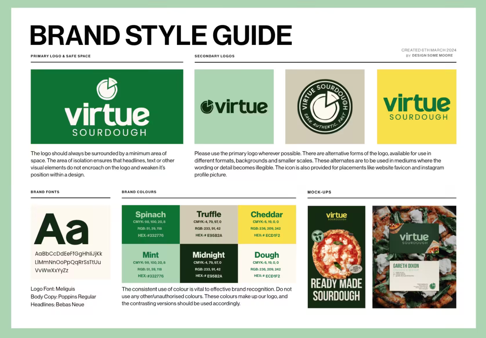
When we build brand identity systems, we set exact colour codes for print and digital. We pick typefaces for headings and body copy.
We set rules for how much space sits around the logo. We write up guidelines for the language you use and how you structure sentences.
These decisions aren’t just for looks. They make sure your business looks and sounds consistent, whether someone reads an email from your sales team or picks up a printed brochure at an event.
Apple’s brand identity includes San Francisco as their system font, specific corner radiuses on their product shots, and a stripped-back writing style with no jargon. Coca-Cola’s identity has their exact red (Pantone 484), the Spencerian script wordmark, and the contour bottle shape.
Logo vs brand: common confusions
Most people swap "logo" and "brand" without thinking. They’ll say they need a new brand when they really mean a logo.
Your brand is your reputation. It’s what people think and feel when they hear your company’s name.
Your logo and brand identity influence that reputation, but they don’t control it. Customer service, product quality, and every interaction someone has with your business shape your brand over time.
Here’s what each term actually covers:
Logo: the symbol or wordmark that identifies you
Brand identity: the visual and verbal system (logo, colours, fonts, tone)
Branding: the strategic work of shaping perception and reputation
Brand: the reputation itself, which exists in people’s minds
You can’t buy a brand. You build one over time by being consistent.
The logo and identity system just make that communication recognisable and cohesive.
Core components of brand identity
A full brand identity has three layers: the visual elements people recognise, the verbal style they hear, and the purpose and character that drive everything.
Each piece shapes how customers experience your brand.
Visual identity and brand visuals
Visual identity covers your logo, colour palette, typography, imagery style, and any design patterns that run through your materials.
These elements create the visual language that makes your brand stand out.
Your colour palette should have two or three primary colours, a few supporting secondary colours, and neutrals for backgrounds and text.
Every colour needs exact specs for digital (hex, RGB) and print (CMYK, Pantone). We always specify these values so teams don’t guess and end up inconsistent.
Typography says a lot before anyone reads a word. You need a headline typeface and a body typeface, with clear rules about size, weight, and spacing.
A serif font signals tradition and authority. A geometric sans-serif suggests modern efficiency.
Imagery guidelines set your photography style, illustration approach, and icon set. This might cover lighting, composition, colour treatments, or whether you use photos or illustrations.
When we built a brand identity for a community organisation, we locked in a warm, approachable photography style to support their mission-led positioning.
Brand voice and tone of voice
Brand voice is how you write and speak. It covers the words you use, the sentence structures you lean on, and the personality that comes through in your copy.
Your tone of voice should name three to five traits that describe how you sound. These could be approachable, technical, playful, or authoritative.
We try to avoid vague words and use specific examples instead.
You also need usage rules. Define which words you use and which you don’t.
Set standards for formality, sentence length, and whether you use contractions. For one retail client, we wrote a tone of voice guide that specified American spelling, sentence case for headings, and a conversational style.
Voice stays steady across all channels. Tone can flex depending on context.
A brand might always sound confident but shift from formal in legal docs to relaxed on social.
Mission, values, and personality
Brand values and mission spell out why you exist and what you stand for. Brand personality is the human side. If your brand were a person, what would they be like?
Your mission statement explains what you do and why it matters.
Brand values are the three to five principles that guide decisions and behaviour. Skip generic words like "integrity" or "excellence." They should be specific enough to guide real choices.
Brand personality shapes everything else. If your personality is adventurous and bold, that shows up in bright colours, dynamic imagery, and confident language.
If you’re calm and reliable, you might use muted tones, structured layouts, and measured copy.
We saw this with a financial services client. Their core values focused on transparency and accessibility, so we used a plain-English tone and an open, uncluttered visual identity.
Logo design in practice
A custom logo doesn’t just appear. Designers make specific choices that add up to something people remember and trust.
Elements of a good logo
A good logo works everywhere you need it. It prints clearly on a business card, shrinks for a favicon, and looks sharp on a billboard.
Simplicity usually wins. The Nike swoosh uses one line. Apple sticks to a single shape.
These marks work because they strip out everything that doesn’t matter.
Versatility is just as important. Your logo needs to work in full colour, black and white, and reversed out of a dark background.
When we design logos, we test them in every context before signing off.
A strong logo also needs to fit your sector without blending in. A law firm and a children’s nursery shouldn’t use the same visual language.
The shapes, weight, and style should signal what you do before anyone reads a word.
Typography, colours, and icons
Typography sets the tone before anyone reads the text. Serif fonts like Times New Roman feel traditional and authoritative.
Sans-serif fonts like Helvetica feel modern and approachable. Script fonts add personality but can lose clarity at small sizes.
Your colour palette does a lot of the emotional work. Colours carry associations that shape how people feel about your business before they even interact with you.
Icons and symbols add meaning when words fall short. They compress complex ideas into a single mark.
The Twitter bird, the Instagram camera, the Spotify sound wave, these all communicate instantly.
When choosing these elements, restraint helps. Pick one or two typefaces. Limit your palette to three or four colours.
Use icons sparingly. Too many choices just create noise.
Logo meaning and colour psychology
Colour psychology isn’t magic, it’s cultural habit. Blue suggests trust and stability because banks, hospitals, and tech companies have used it for years.
Red signals energy, urgency, or appetite. Green connects to nature
Examples of full brand identity projects
Full brand identity work covers much more than just designing a logo. It shapes the whole visual and verbal system that defines how people experience a brand at every level.
For The Vale Business Networking, we created a new logo, picked out typefaces, built a colour palette, designed business cards, and rolled the system out across their website and print bits. The logo mattered, but the typography and colour choices gave the brand its personality.
A health and wellbeing client wanted their brand to feel calm and accessible. We developed a soft colour palette, paired it with a clean sans-serif typeface, and set up photography guidelines showing real people in natural settings.
The logo anchored the system, but the full brand identity made everything feel warm and trustworthy.
The logo gives you a mark. The system gives you a language.
Impact on customer perception and business results
Your logo makes the first impression. The rest of your brand identity decides if customers stick around, trust you, or come back.
Visual elements matter, but the full brand experience is what drives real decisions.
Brand image and presence
A logo sits on your website, business cards, and social media. It identifies you, sure, but brand presence is what people actually feel when they cross paths with you.
We rebuilt a site for a client in the education sector. Instead of just updating their logo, we looked at how messaging, tone, and visuals worked together across every page.
Enquiry form submissions climbed noticeably.
Brand image is more than a single mark. Colour palette, typography, photography style, and communication, these shape how people see your values and expertise.
Marketing materials that follow a consistent brand system build recognition faster. People remember the overall experience more than any one visual.
Customer experience beyond visuals
Brand identity shapes every interaction a customer has with your business. The words in your emails, how fast your website loads, how easy it is to find things, and how helpful your support team is, they all count.
We've seen businesses pour thousands into a shiny new logo, then ignore slow websites and confusing navigation. The logo looks slick, but customers still leave annoyed.
Your brand promise sets expectations. If you say you're responsive and reliable, but then take three days to reply to an email, the logo can't fix that.
The customer experience either backs up or undermines your brand identity. A strong visual system with poor service just creates distrust. People notice when what you show doesn't match what you deliver.
Building trust and loyalty
Trust builds through consistency over time. A memorable logo helps people recognise you, but brand identity gives them reasons to come back.
We work with clients on Growth Partner retainers because brand building never really stops. It needs ongoing attention. Messaging, design, and service quality have to line up as things change.
Customers stick around when their experience meets or beats their expectations. Brand identity sets those expectations through design, messaging, and the values you show in your actions.
Research in the Journal of Marketing found that brands with structured visual designs saw higher financial valuations when they actually delivered functional benefits. The design itself changed what customers believed about performance.
When you take your brand beyond just logo recognition, you start building emotional connections. Competitors can't copy that easily.
People might forget what your logo looked like, but they'll remember how your brand made them feel. They'll remember if you solved their problems.
Choosing the right approach for your business
The scale of your branding should fit where your business is now and what you want to achieve.
Some businesses start with a strong logo and add identity elements later. Others need a complete brand identity from the start.
When is a logo enough?
A standalone logo can work if you're testing an idea, launching fast, or running a business with just a few customer touchpoints.
If you're selling through one channel, things are simple, and you don't have a team under your name, a good logo might be enough for now.
We've worked with early-stage businesses that started with just a logo and basic colour palette. They used it everywhere - website, social, email signatures - for months before investing in more.
The risk comes if you treat a logo as your whole branding strategy. Once things start growing, you'll need proper guidelines for marketing, a clear tone of voice, and visual systems that work in different places.
When you need a full brand identity
You need a full brand identity when you've got multiple people creating content, you're entering competitive markets, or your audience expects a certain level of professionalism before they'll trust you.
A full identity covers typography systems, colour palettes with clear use cases, photography styles, layout grids, tone of voice guidelines, and rules for how everything fits together.
This really matters when you're hiring designers, working with agencies, or briefing a team on campaigns.
We built a full brand identity for a professional services client launching nationally. They needed consistency across regional offices.
The identity system meant every team could produce materials that actually looked like they came from the same business. The investment paid off in lower design costs and faster campaign delivery.
Practical steps to strengthen your branding strategy
Start by gathering what you already use. Dig up every version of your logo, jot down your main colours, and make a note of your fonts across the website and any marketing bits.
This quick audit highlights where things have started to drift.
Pick what to sort out first. Usually, it makes sense to settle on logo rules, nail down two or three brand colours (with their codes), and stick with a couple of typefaces for everything you write.
Keep your guidelines simple so people actually use them. A short PDF with logo files, colour codes, and a few real examples usually works far better than a massive manual nobody touches.
We’ve watched businesses pull their branding together just by giving their team clear rules and the right files.
If you work with agencies or freelancers, share your guidelines and ask them to stick to your system.
The good ones will respect your brand and actually follow it.
Add us as a preferred source on Google.
If this article has been useful, let us know!
Book a free intro call to talk through your needs.